
Seurat Guided Clustering Tutorial
While the vignette on the Seurat website already provides good instructions, I will be using this to give additional thoughts and details that could help beginners to Seurat. In addition, I will provide some recommendations on the workflow as well.
Loading the files
The first thing the tutorial asks you to do is download the raw data from 10x Genomics. The raw data contains three key files within it: barcodes.tsv, genes.tsv, and matrix.mtx. You will also notice they are contained in a folder called hg19. That simply means the counts were generated using the hg19 genome (Genome Reference Consortium Human Build 37 (GRCh37)) as the reference transcriptome.
Let’s load in each of the files and take a look at them.
download.file("https://s3-us-west-2.amazonaws.com/10x.files/samples/cell/pbmc3k/pbmc3k_filtered_gene_bc_matrices.tar.gz", 'pbmc3k')
untar('pbmc3k', files = 'filtered_gene_bc_matrices/')
barcodes <- read.table("filtered_gene_bc_matrices/hg19/barcodes.tsv")
head(barcodes)
##                 V1
## 1 AAACATACAACCAC-1
## 2 AAACATTGAGCTAC-1
## 3 AAACATTGATCAGC-1
## 4 AAACCGTGCTTCCG-1
## 5 AAACCGTGTATGCG-1
## 6 AAACGCACTGGTAC-1
genes <- read.delim("filtered_gene_bc_matrices/hg19/genes.tsv", header=FALSE)
head(genes)
##                V1           V2
## 1 ENSG00000243485   MIR1302-10
## 2 ENSG00000237613      FAM138A
## 3 ENSG00000186092        OR4F5
## 4 ENSG00000238009 RP11-34P13.7
## 5 ENSG00000239945 RP11-34P13.8
## 6 ENSG00000237683   AL627309.1
library(Matrix)
mat <- readMM(file = "filtered_gene_bc_matrices/hg19/matrix.mtx")
mat[1:5, 1:10]
## 5 x 10 sparse Matrix of class "dgTMatrix"
##
## [1,]..........
## [2,]..........
## [3,]..........
## [4,]..........
## [5,]..........
You will notice when we take a look at the matrix file, it contains ..
These are used when no count is detected rather using a value of 0. This
is called a sparse matrix to reduce memory and increase computational
speed. It is pretty much standard to work using sparse matrices when
dealing with single-cell data.
Generating the Seurat Object
Next, we will generate a Seurat object based on the files we loaded up
earlier.
library(dplyr)
##
## Attaching package: 'dplyr'

## The following objects are masked from 'package:stats':
##
##     filter, lag

## The following objects are masked from 'package:base':
##
##     intersect, setdiff, setequal, union
library(Seurat)
## Attaching SeuratObject
library(patchwork)

# Load the PBMC dataset
pbmc.data <- Read10X(data.dir = "filtered_gene_bc_matrices/hg19/")
# Initialize the Seurat object with the raw (non-normalized data).
pbmc <- CreateSeuratObject(counts = pbmc.data, project = "pbmc3k", min.cells = 3, min.features = 200)
## Warning: Feature names cannot have underscores ('_'), replacing with dashes
## ('-')
pbmc
## An object of class Seurat
## 13714 features across 2700 samples within 1 assay
## Active assay: RNA (13714 features, 0 variable features)
Pre-processing the data
Now we will pre-process the data and perform quality control on the cells. There are a couple of metrics that are used within the community.
- The number of unique genes detected in each individual cell.
- Low-quality cells or empty droplets will often have very few genes.
- Sometimes this could be ambient mRNA that is detected.
- Cell doublets or multiplets may exhibit an aberrantly high gene count. There are some additional packages that can be used to detect doublets.
- The percentage of reads that map to the mitochondrial genome
- Low-quality / dying cells often exhibit extensive mitochondrial contamination.
- This is often calculated by searching for genes containing
MT-
# The [[ operator can add columns to object metadata. This is a great place to stash QC stats
pbmc[["percent.mt"]] <- PercentageFeatureSet(pbmc, pattern = "^MT-")
Let’s take a look at the metadata which includes some of the QC metrics.
nCount_RNAis the number of unique counts in each cell.nFeature_RNAis the number of unique genes in each cell.percent.mtis the mitochondrial mapping that we just calculated.
head(pbmc@meta.data, 5)
##                  orig.ident nCount_RNA nFeature_RNA percent.mt
## AAACATACAACCAC-1     pbmc3k       2419          779  3.0177759
## AAACATTGAGCTAC-1     pbmc3k       4903         1352  3.7935958
## AAACATTGATCAGC-1     pbmc3k       3147         1129  0.8897363
## AAACCGTGCTTCCG-1     pbmc3k       2639          960  1.7430845
## AAACCGTGTATGCG-1     pbmc3k        980          521  1.2244898
Seurat recommends a threshold for filtering for the QC metrics.
- Cells are filtered for unique feature counts over 2,500 or less than 200
- Cells are filtered for<5% mitochondrial counts
# Visualize QC metrics as a violin plot
VlnPlot(pbmc, features = c("nFeature_RNA", "nCount_RNA", "percent.mt"), ncol = 3)
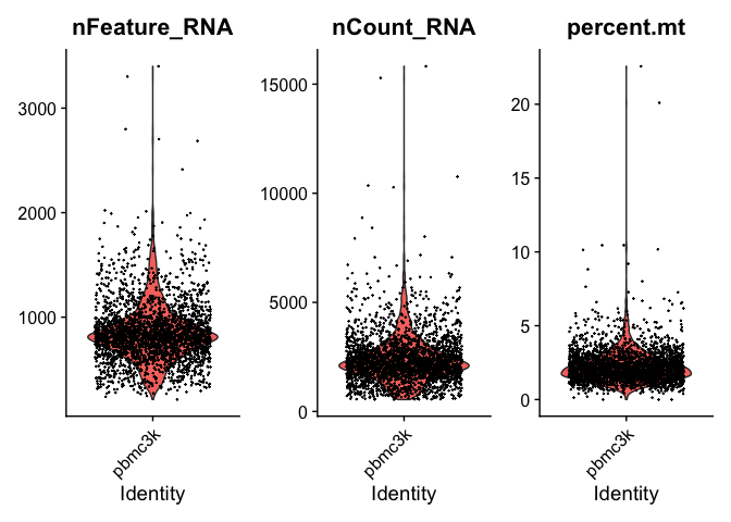
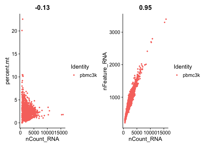
We can take a look and see that the unique counts and feature are correlated. In addition, we see that low counts appear to correlate with high mitochondrial mapping percentage.
# FeatureScatter is typically used to visualize feature-feature relationships, but can be used
# for anything calculated by the object, i.e. columns in object metadata, PC scores etc.

plot1 <- FeatureScatter(pbmc, feature1 = "nCount_RNA", feature2 = "percent.mt")
plot2 <- FeatureScatter(pbmc, feature1 = "nCount_RNA", feature2 = "nFeature_RNA")
plot1 + plot2
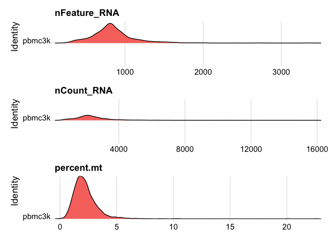
I find that the density plots provide a better visualization of the distributions in case you may have a bimodal distribution.
# Visualize QC metrics as ridge plots
RidgePlot(pbmc, features = c("nFeature_RNA", "nCount_RNA", "percent.mt"), ncol =1)
## Picking joint bandwidth of 36.2

## Picking joint bandwidth of 139

## Picking joint bandwidth of 0.153
 Let’s use an adaptive
threshold rather than fixed threshold. This provides a more elegant
method of detecting the thresholds rather than by eye using the graphs.
First, we assume that most of the cells are high-quality. Next, we then
identify cells that are outliers using the median absolute deviation
(MAD) from the median value of each metric for all cells. Outliers will
be beyond the MAD threshold and we can specify higher or lower than the
threshold.
Let’s use an adaptive
threshold rather than fixed threshold. This provides a more elegant
method of detecting the thresholds rather than by eye using the graphs.
First, we assume that most of the cells are high-quality. Next, we then
identify cells that are outliers using the median absolute deviation
(MAD) from the median value of each metric for all cells. Outliers will
be beyond the MAD threshold and we can specify higher or lower than the
threshold.
To identify outliers based on unique genes and counts, we use
log-transformed nCount_RNA and nFeature_RNA that are more than 3
MADs above and below the median. We will be using the scater library
for this.
library(scater)
## Warning: package 'scater' was built under R version 4.0.4

## Loading required package: SingleCellExperiment

## Loading required package: SummarizedExperiment

## Loading required package: MatrixGenerics

## Loading required package: matrixStats

##
## Attaching package: 'matrixStats'

## The following object is masked from 'package:dplyr':
##
##     count

##
## Attaching package: 'MatrixGenerics'

## The following objects are masked from 'package:matrixStats':
##
##     colAlls, colAnyNAs, colAnys, colAvgsPerRowSet, colCollapse,
##     colCounts, colCummaxs, colCummins, colCumprods, colCumsums,
##     colDiffs, colIQRDiffs, colIQRs, colLogSumExps, colMadDiffs,
##     colMads, colMaxs, colMeans2, colMedians, colMins, colOrderStats,
##     colProds, colQuantiles, colRanges, colRanks, colSdDiffs, colSds,
##     colSums2, colTabulates, colVarDiffs, colVars, colWeightedMads,
##     colWeightedMeans, colWeightedMedians, colWeightedSds,
##     colWeightedVars, rowAlls, rowAnyNAs, rowAnys, rowAvgsPerColSet,
##     rowCollapse, rowCounts, rowCummaxs, rowCummins, rowCumprods,
##     rowCumsums, rowDiffs, rowIQRDiffs, rowIQRs, rowLogSumExps,
##     rowMadDiffs, rowMads, rowMaxs, rowMeans2, rowMedians, rowMins,
##     rowOrderStats, rowProds, rowQuantiles, rowRanges, rowRanks,
##     rowSdDiffs, rowSds, rowSums2, rowTabulates, rowVarDiffs, rowVars,
##     rowWeightedMads, rowWeightedMeans, rowWeightedMedians,
##     rowWeightedSds, rowWeightedVars

## Loading required package: GenomicRanges

## Loading required package: stats4

## Loading required package: BiocGenerics

## Warning: package 'BiocGenerics' was built under R version 4.0.5

## Loading required package: parallel

##
## Attaching package: 'BiocGenerics'

## The following objects are masked from 'package:parallel':
##
##     clusterApply, clusterApplyLB, clusterCall, clusterEvalQ,
##     clusterExport, clusterMap, parApply, parCapply, parLapply,
##     parLapplyLB, parRapply, parSapply, parSapplyLB

## The following objects are masked from 'package:dplyr':
##
##     combine, intersect, setdiff, union

## The following objects are masked from 'package:stats':
##
##     IQR, mad, sd, var, xtabs

## The following objects are masked from 'package:base':
##
##     anyDuplicated, append, as.data.frame, basename, cbind, colnames,
##     dirname, do.call, duplicated, eval, evalq, Filter, Find, get, grep,
##     grepl, intersect, is.unsorted, lapply, Map, mapply, match, mget,
##     order, paste, pmax, pmax.int, pmin, pmin.int, Position, rank,
##     rbind, Reduce, rownames, sapply, setdiff, sort, table, tapply,
##     union, unique, unsplit, which.max, which.min

## Loading required package: S4Vectors

##
## Attaching package: 'S4Vectors'

## The following objects are masked from 'package:dplyr':
##
##     first, rename

## The following object is masked from 'package:Matrix':
##
##     expand

## The following object is masked from 'package:base':
##
##     expand.grid

## Loading required package: IRanges

##
## Attaching package: 'IRanges'

## The following objects are masked from 'package:dplyr':
##
##     collapse, desc, slice

## Loading required package: GenomeInfoDb

## Warning: package 'GenomeInfoDb' was built under R version 4.0.5

## Loading required package: Biobase

## Welcome to Bioconductor
##
##     Vignettes contain introductory material; view with
##     'browseVignettes()'. To cite Bioconductor, see
##     'citation("Biobase")', and for packages 'citation("pkgname")'.

##
## Attaching package: 'Biobase'

## The following object is masked from 'package:MatrixGenerics':
##
##     rowMedians

## The following objects are masked from 'package:matrixStats':
##
##     anyMissing, rowMedians

##
## Attaching package: 'SummarizedExperiment'

## The following object is masked from 'package:SeuratObject':
##
##     Assays

## The following object is masked from 'package:Seurat':
##
##     Assays

## Loading required package: ggplot2
qc.nCount_RNA <- isOutlier(pbmc$nCount_RNA, log=TRUE, type="both")
qc.nFeature_RNA  <- isOutlier(pbmc$nFeature_RNA, log=TRUE, type="both")
We can see the thresholds that are identified in both QC metric.
attr(qc.nCount_RNA, "thresholds")
##     lower    higher
##  802.1223 6012.0706
attr(qc.nFeature_RNA, "thresholds")
##     lower    higher
##  399.7497 1665.6823
We can also do the same for percent.mt. In this case, we want to
remove cells above the MAD.
qc.percent.mt <- isOutlier(pbmc$percent.mt,  type="higher")
attr(qc.percent.mt, "thresholds")
##    lower   higher
##     -Inf 4.436775
Another reason to use adaptive thresholds is if your data contains
multiple batches. In this case, you would detect the QC threshold for
each batch rather than for your entire data set. It makes little sense
to a single threshold from a data set with samples from multiple
batches. While there are no batches in this current data set, you would
need to include a batch parameter when using the isOutlier function.
Let’s continue on with the original tutorial and use the thresholds that were fixed but feel free to try the adaptive thresholds.
pbmc <- subset(pbmc, subset = nFeature_RNA > 200 & nFeature_RNA < 2500 & percent.mt < 5)
Normalizing the data
After filtering out the low quality cells from the data set, the next
step is to normalize the data. By default, Seurat employs a
global-scaling normalization method “LogNormalize” that normalizes the
feature expression measurements for each cell by dividing by the total
expression, multiplies the result by a scale factor (10,000 by default),
and then log-transforms the result to obtain the normalized data.
pbmc <- NormalizeData(pbmc)
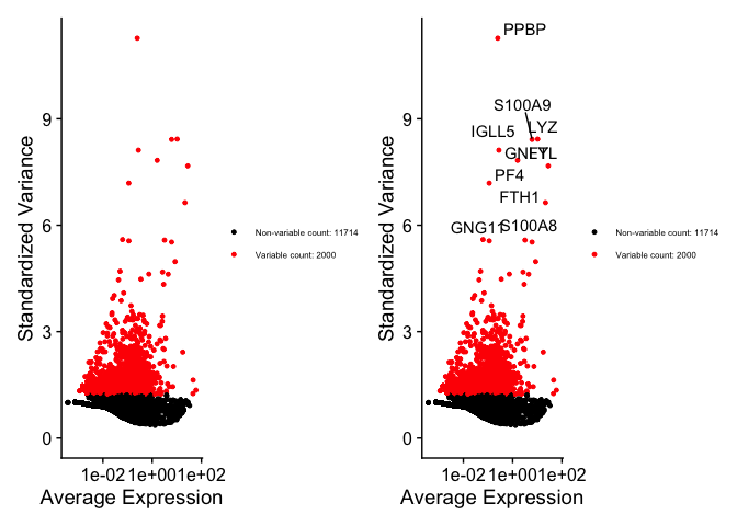
It is common to identify highly variable features or genes for dimensional reduction. By reducing your analysis to the highly variable genes, you account for most of the biological heterogeneity or factors in your data and hopefully ignore a majority of the noise while reducing computational work and time. As such, the highly variable genes should enable us to isolate the real biological signals.
pbmc <- FindVariableFeatures(pbmc, selection.method = "vst", nfeatures = 2000)

# Identify the 10 most highly variable genes
top10 <- head(VariableFeatures(pbmc), 10)

# plot variable features with and without labels
plot1 <- VariableFeaturePlot(pbmc) + theme(legend.text = element_text(size = 6))
plot2 <- LabelPoints(plot = plot1, points = top10, repel = TRUE) + theme(legend.text = element_text(size = 6))
## When using repel, set xnudge and ynudge to 0 for optimal results
plot1 + plot2
## Warning: Transformation introduced infinite values in continuous x-axis

## Warning: Removed 1 rows containing missing values (geom_point).

## Warning: Transformation introduced infinite values in continuous x-axis

## Warning: Removed 1 rows containing missing values (geom_point).
Scaling the data
Next, we will need to scale the data. This is a standard pre-processing step prior dimensional reduction, like PCA, which I discussed in a previous post.
- All gene expression will be centered to 0.
- Scales the expression of each gene to have a variance of 1 so all genes have equal contributions
As an additional step, we typically scale the highly variable genes as these are the genes that will be used for dimensional reduction.
pbmc <- ScaleData(pbmc, features = VariableFeatures(object = pbmc)) #VariableFeatures is used to call the highly variable genes from the object.
## Centering and scaling data matrix
Perform linear dimensional reduction
PCA is already built into Seurat and can be called the function
RunPCA.
pbmc <- RunPCA(pbmc, features = VariableFeatures(object = pbmc), verbose = FALSE)
# Examine and visualize PCA results a few different ways
print(pbmc[["pca"]], dims = 1:5, nfeatures = 5)
## PC_ 1
## Positive:  CST3, TYROBP, LST1, AIF1, FTL
## Negative:  MALAT1, LTB, IL32, IL7R, CD2
## PC_ 2
## Positive:  CD79A, MS4A1, TCL1A, HLA-DQA1, HLA-DQB1
## Negative:  NKG7, PRF1, CST7, GZMB, GZMA
## PC_ 3
## Positive:  HLA-DQA1, CD79A, CD79B, HLA-DQB1, HLA-DPB1
## Negative:  PPBP, PF4, SDPR, SPARC, GNG11
## PC_ 4
## Positive:  HLA-DQA1, CD79B, CD79A, MS4A1, HLA-DQB1
## Negative:  VIM, IL7R, S100A6, IL32, S100A8
## PC_ 5
## Positive:  GZMB, NKG7, S100A8, FGFBP2, GNLY
## Negative:  LTB, IL7R, CKB, VIM, MS4A7
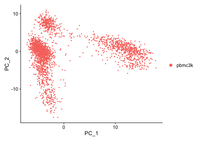
We can visualize the first two principal components.
DimPlot(pbmc, reduction = "pca")
Let’s inspect the contribution of each of the principal components. Typically only the the principal components containing a majority of the variance is used. This can be estimated by using an ‘elbow plot’ and observing where there is a large drop off in variance.
ElbowPlot(pbmc)
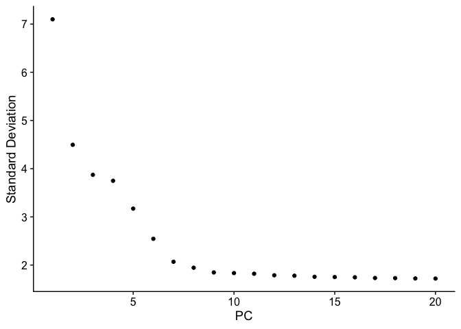
It may be difficult to estimate by visualization so you can use the second derivative which should find the maximum change in the slope. The following code should provide another method for estimating the drop off.
variance <- pbmc@reductions[["pca"]]@stdev
dy <- -diff(range(variance))
dx <- length(variance) - 1
l2 <- sqrt(dx^2 + dy^2)
dx <- dx/l2
dy <- dy/l2
dy0 <- variance - variance[1]
dx0 <- seq_along(variance) - 1
parallel.l2 <- sqrt((dx0 * dx)^2 + (dy0 * dy)^2)
normal.x <- dx0 - dx * parallel.l2
normal.y <- dy0 - dy * parallel.l2
normal.l2 <- sqrt(normal.x^2 + normal.y^2)
below.line <- normal.x < 0 & normal.y < 0
if (!any(below.line)) {
    length(variance)
} else {
    which(below.line)[which.max(normal.l2[below.line])].
## [1] 3
While the largest drop off does occur at PC3, we can see that there in additional drop off at around PC9-10, suggesting that the majority of true signal is captured in the first 10 PCs.
Cluster the cells
To aid in summarizing the data for easier interpretation, scRNA-seq is
often clustered to empirically define groups of cells within the data
that have similar expression profiles. This generates discrete groupings
of cells for the downstream analysis. Seurat uses a graph-based
clustering approach. There are additional approaches such as k-means
clustering or hierarchical clustering.
The major advantage of graph-based clustering compared to the other two
methods is its scalability and speed. Simply, Seurat first constructs
a KNN graph based on the euclidean distance in PCA space. Each node is a
cell that is connected to its nearest neighbors. Edges, which are the
lines between the neighbors, are weighted based on the similarity
between the cells involved, with higher weight given to cells that are
more closely related. A refinement step (Jaccard similarity) is used to
refine the edge weights between any two cells based on the shared
overlap in their local neighborhoods.
Here we use the first 10 PCs to construct the neighbor graph.
pbmc <- FindNeighbors(pbmc, dims = 1:10)
## Computing nearest neighbor graph

## Computing SNN
Next, we can apply algorithms to identify “communities” of cells. There
are two main community detection algorithm,
LouvainLouvain
and the improved version
LeidenLeiden. We
use the default Louvain while controlling the resolution parameter to
adjust the number of clusters.
pbmc <- FindClusters(pbmc, resolution = 0.5)
## Modularity Optimizer version 1.3.0 by Ludo Waltman and Nees Jan van Eck
##
## Number of nodes: 2638
## Number of edges: 95965
##
## Running Louvain algorithm...
## Maximum modularity in 10 random starts: 0.8723
## Number of communities: 9
## Elapsed time: 0 seconds
Visualization of 2D Embedding
The high-dimensional space can be embedded in 2D using either tSNE and UMAP to visualize and explore the data sets. These embeddings attempt to summarize all of the data using a 2D graph to organize the data to better interpret the relationships between the cells. Cells that are more similar to one another should localize within the graph. Different types of embeddings will relay different information on the relationship between cells. UMAP is more recommended to be more faithful to the global connectivity of the manifold than tSNE, while tSNE might preserve the local structure more.
# If you haven't installed UMAP, you can do so via reticulate::py_install(packages =
# 'umap-learn')
# Here we generate a UMAP embedding.
pbmc <- RunUMAP(pbmc, dims = 1:10)
## Warning: The default method for RunUMAP has changed from calling Python UMAP via reticulate to the R-native UWOT using the cosine metric
## To use Python UMAP via reticulate, set umap.method to 'umap-learn' and metric to 'correlation'
## This message will be shown once per session

## 16:06:29 UMAP embedding parameters a = 0.9922 b = 1.112

## 16:06:29 Read 2638 rows and found 10 numeric columns

## 16:06:29 Using Annoy for neighbor search, n_neighbors = 30

## 16:06:29 Building Annoy index with metric = cosine, n_trees = 50

## 0%   10   20   30   40   50   60   70   80   90   100%

## [----|----|----|----|----|----|----|----|----|----|

## **************************************************|
## 16:06:30 Writing NN index file to temp file /var/folders/05/_drvy3j57yb2pndzt041kp9c0n9q3g/T//RtmpUi6hrk/file12d081ba10899
## 16:06:30 Searching Annoy index using 1 thread, search_k = 3000
## 16:06:30 Annoy recall = 100%
## 16:06:31 Commencing smooth kNN distance calibration using 1 thread
## 16:06:32 Initializing from normalized Laplacian + noise
## 16:06:32 Commencing optimization for 500 epochs, with 105124 positive edges
## 16:06:35 Optimization finished
# Here we generate a tSNE embedding.
pbmc <- RunTSNE(pbmc, dims = 1:10)
We can visualize all three of the dimensional reductions that we generated. You will notice that UMAP and tSNE generate better visualizations as they are more adept at interpreting non-linear data. PCA is linear technique and does not capture the non-linear relationship of gene expression profiles very well.
# note that you can set `label = TRUE` or use the LabelClusters function to help label
# individual clusters
plot1 <- DimPlot(pbmc, reduction = "umap")
plot2 <- DimPlot(pbmc, reduction = "tsne")
plot3 <- DimPlot(pbmc, reduction = "pca")
plot1 +  plot2 + plot3 + plot_layout(nrow = 2)
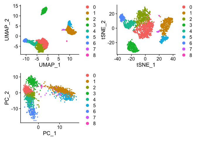
We can see that cells are clustered closer together while also providing some global relationship between the clusters within the UMAP embedding. tSNE generates some similar clusters with the same local relationship but the global relationship can not be estimated using tSNE. In addition, tSNE does not scale with larger data sets. The PCA captures highest variation within the first two PCs but does not include information from the additional PCs. You can see here the failure of PCA to resolve the differences between the clusters unlike UMAP and tSNE.
Finding Marker Genes
To interpret our clusters, we can identify the genes and markers that
drive separation of the clusters. Seurat can find these markers via
differential expression. By default, FindAllMarkers uses Wilcoxon
rank-sum (Mann-Whitney-U) test to find DEs. You can choose which test by
modifying the test.use parameter. If you have blocking factors (i.e.,
batches), you can include it using the latent.vars parameter.
# find markers for every cluster compared to all remaining cells, report only the positive ones
pbmc.markers <- FindAllMarkers(pbmc, only.pos = TRUE, min.pct = 0.25, logfc.threshold = 0.25)
## Calculating cluster 0

## Calculating cluster 1

## Calculating cluster 2

## Calculating cluster 3

## Calculating cluster 4

## Calculating cluster 5

## Calculating cluster 6

## Calculating cluster 7

## Calculating cluster 8
pbmc.markers %>% group_by(cluster) %>% top_n(n = 2, wt = avg_log2FC)
## Registered S3 method overwritten by 'cli':
##   method     from
##   print.boxx spatstat.geom

## # A tibble: 18 × 7
## # Groups:   cluster [9]
##        p_val avg_log2FC pct.1 pct.2 p_val_adj cluster gene
##        <dbl>      <dbl> <dbl> <dbl>     <dbl> <fct>   <chr>
##  1 1.74e-109       1.07 0.897 0.593 2.39e-105 0       LDHB
##  2 1.17e- 83       1.33 0.435 0.108 1.60e- 79 0       CCR7
##  3 0               5.57 0.996 0.215 0         1       S100A9
##  4 0               5.48 0.975 0.121 0         1       S100A8
##  5 7.99e- 87       1.28 0.981 0.644 1.10e- 82 2       LTB
##  6 2.61e- 59       1.24 0.424 0.111 3.58e- 55 2       AQP3
##  7 0               4.31 0.936 0.041 0         3       CD79A
##  8 9.48e-271       3.59 0.622 0.022 1.30e-266 3       TCL1A
##  9 1.17e-178       2.97 0.957 0.241 1.60e-174 4       CCL5
## 10 4.93e-169       3.01 0.595 0.056 6.76e-165 4       GZMK
## 11 3.51e-184       3.31 0.975 0.134 4.82e-180 5       FCGR3A
## 12 2.03e-125       3.09 1     0.315 2.78e-121 5       LST1
## 13 1.05e-265       4.89 0.986 0.071 1.44e-261 6       GZMB
## 14 6.82e-175       4.92 0.958 0.135 9.36e-171 6       GNLY
## 15 1.48e-220       3.87 0.812 0.011 2.03e-216 7       FCER1A
## 16 1.67e- 21       2.87 1     0.513 2.28e- 17 7       HLA-DPB1
## 17 7.73e-200       7.24 1     0.01  1.06e-195 8       PF4
## 18 3.68e-110       8.58 1     0.024 5.05e-106 8       PPBP
You can export the markers as a ‘csv’ for analysis outside of R.
write.csv(pbmc.markers, 'pbmc.markers.csv')
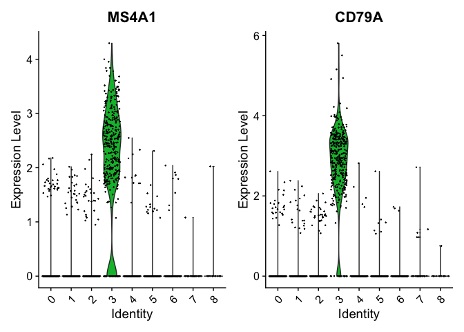
We can visualize some of these markers using VlnPlot.
VlnPlot(pbmc, features = c("MS4A1", "CD79A"))
# you can plot raw counts as well
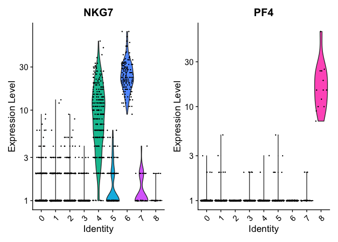
VlnPlot(pbmc, features = c("NKG7", "PF4"), slot = "counts", log = TRUE)
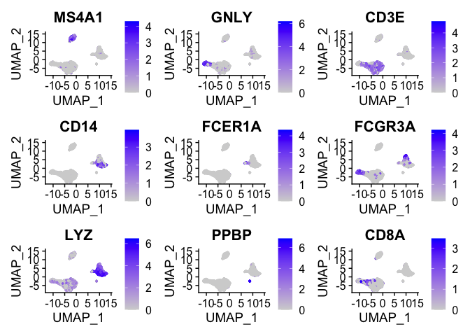
We can visualize the localization of these markers in a UMAP embedding
by using FeaturePlot.
FeaturePlot(pbmc, features = c("MS4A1", "GNLY", "CD3E", "CD14", "FCER1A", "FCGR3A", "LYZ", "PPBP",
    "CD8A"))
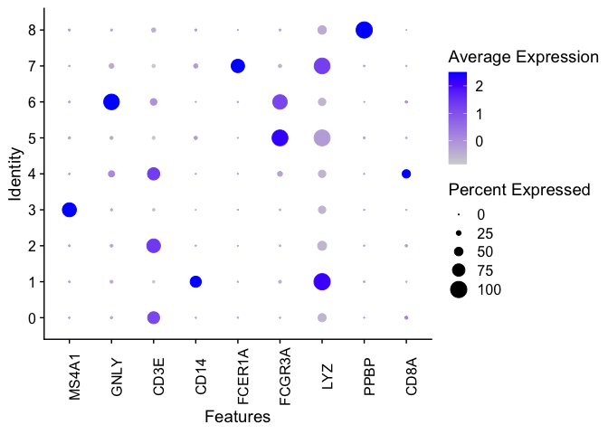
We can generate a dot plot to visualize the markers.
DotPlot(pbmc, features = c("MS4A1", "GNLY", "CD3E", "CD14", "FCER1A", "FCGR3A", "LYZ", "PPBP",
    "CD8A")) + theme(axis.text.x = element_text(angle = 90))
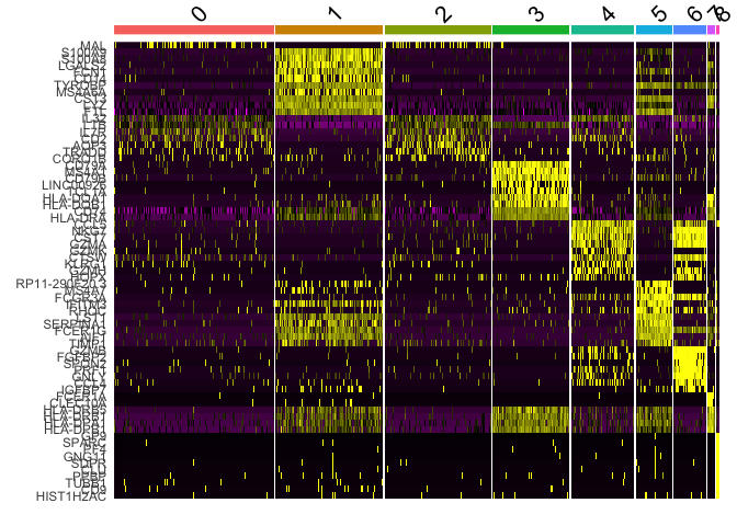
Another common method of visualization is to generate a heat map. We can
use DoHeatmap to see the top 10 markers per cluster.
top10 <- pbmc.markers %>% group_by(cluster) %>% top_n(n = 10, wt = avg_log2FC)
DoHeatmap(pbmc, features = top10$gene) + NoLegend()
## Warning in DoHeatmap(pbmc, features = top10$gene): The following features were
## omitted as they were not found in the scale.data slot for the RNA assay: CD8A,
## VPREB3, PIK3IP1, PRKCQ-AS1, NOSIP, LEF1, CD3E, CD3D, CCR7, LDHB, RPS3A
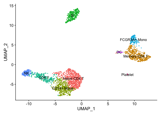
Assigning cell type identity to clusters
We can use canonical markers to easily match the unbiased clustering to known cell types based on the table below:
| Cluster ID | Markers | Cell Type |
|---|---|---|
| 0 | IL7R, CCR7 | Naive CD4+ T |
| 1 | IL7R, S100A4 | Memory CD4+ |
| 2 | CD14, LYZ CD14+ | Mono |
| 3 | MS4A1 | B |
| 4 | CD8A CD8+ | T |
| 5 | FCGR3A, MS4A7 FCGR3A+ | Mono |
| 6 | GNLY, NKG7 | NK |
| 7 | FCER1A, CST3 | DC |
| 8 | PPBP | Platelet |
new.cluster.ids <- c("Naive CD4 T", "Memory CD4 T", "CD14+ Mono", "B", "CD8 T", "FCGR3A+ Mono",
    "NK", "DC", "Platelet")
names(new.cluster.ids) <- levels(pbmc)
pbmc <- RenameIdents(pbmc, new.cluster.ids)
DimPlot(pbmc, reduction = "umap", label = TRUE, pt.size = 0.5) + NoLegend()
Cell Annotation
We can also use annotation packages like SingleR to perform automatic
annotation. You can find more information
here.
We initialize the Human Primary Cell Atlas data.
library(SingleR)
ref <- HumanPrimaryCellAtlasData()
## Warning: 'HumanPrimaryCellAtlasData' is deprecated.
## Use 'celldex::HumanPrimaryCellAtlasData' instead.
## See help("Deprecated")

## snapshotDate(): 2020-10-27

## see?celldex and browseVignettes('celldex') for documentation

## loading from cache

## see?celldex and browseVignettes('celldex') for documentation

## loading from cache
We can see some of the labels within this reference set.
head(as.data.frame(colData(ref)))
##                                              label.main
## GSM112490                                            DC
## GSM112491                                            DC
## GSM112540                                            DC
## GSM112541                                            DC
## GSM112661                                            DC
We use our ref reference to annotate each cell in pbmc via the
SingleR function.
pbmc.sce <- as.SingleCellExperiment(pbmc) #convert to SingleCellExperiment
pred.pbmc <- SingleR(test = pbmc.sce, ref = ref, assay.type.test=1,
    labels = ref$label.main)
Each row of the output Data Frame contains prediction results for each cell.
pred.pbmc
## DataFrame with 2638 rows and 5 columns
##                                           scores     first.labels
##                                         <matrix>      <character>
## AAACATACAACCAC-1 0.1031269:0.234280:0.222822:...          T_cells
## AAACATTGAGCTAC-1 0.0984977:0.361135:0.300626:...           B_cell
## AAACATTGATCAGC-1 0.0671635:0.266281:0.237642:...          T_cells
## AAACCGTGCTTCCG-1 0.0836640:0.235213:0.273059:...         Monocyte
## AAACCGTGTATGCG-1 0.0739783:0.164291:0.175458:...          NK_cell
##.........
## TTTCGAACTCTCAT-1 0.0965528:0.249749:0.307289:... Pre-B_cell_CD34-
## TTTCTACTGAGGCA-1 0.1368350:0.302956:0.269191:... Pre-B_cell_CD34-
## TTTCTACTTCCTCG-1 0.0749830:0.272021:0.225157:...           B_cell
## TTTGCATGAGAGGC-1 0.0673739:0.232823:0.184013:...           B_cell
## TTTGCATGCCTCAC-1 0.0890275:0.242453:0.243141:...          T_cells
##                       tuning.scores           labels    pruned.labels
##                         <DataFrame>      <character>      <character>
## AAACATACAACCAC-1 0.301975:0.2133145          T_cells          T_cells
## AAACATTGAGCTAC-1 0.326636:0.0220241           B_cell           B_cell
## AAACATTGATCAGC-1 0.307280:0.1090948          T_cells          T_cells
## AAACCGTGCTTCCG-1 0.286386:0.2360274         Monocyte         Monocyte
## AAACCGTGTATGCG-1 0.299925:0.2107053          NK_cell          NK_cell
##............
## TTTCGAACTCTCAT-1  0.259345:0.134353         Monocyte         Monocyte
## TTTCTACTGAGGCA-1  0.157336:0.129647 Pre-B_cell_CD34- Pre-B_cell_CD34-
## TTTCTACTTCCTCG-1  0.235417:0.173613           B_cell           B_cell
## TTTGCATGAGAGGC-1  0.228548:0.149524           B_cell           B_cell
## TTTGCATGCCTCAC-1  0.288418:0.194118          T_cells          T_cells
# Summarizing the distribution:
table(pred.pbmc$labels)
##
##           B_cell              CMP         Monocyte          NK_cell
##              333                4              617              193
##        Platelets Pre-B_cell_CD34- Pro-B_cell_CD34+          T_cells
##               12               63                5             1411
Let’s see how it compared to our manual annotations. First, we will add the predicted labels as new metadata.
pbmc <- AddMetaData(pbmc, pred.pbmc$labels, col.name = 'SingleR.Annotations')
plot1 <- DimPlot(pbmc, reduction = "umap", label = TRUE, pt.size = 0.5) + NoLegend() + ggtitle('Manual Annotations')
plot2 <- DimPlot(pbmc, reduction = "umap", group.by = 'SingleR.Annotations', label = TRUE, pt.size = 0.5) + NoLegend() + ggtitle('SingleR Annotations')
plot1 + plot2
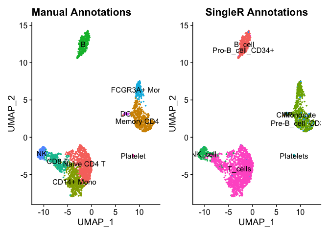
We can see that the predicted labels and manually annotated labels match up pretty well. Your choice of reference data and parameters can be used to further fine-tine the predicted labels. Here we used a bulk reference data set but a single-cell reference data that is well-annotated set could be used as well.
Saving your results
Finally, always make sure to save your data.
saveRDS(pbmc, file = "pbmc3k_final.rds")