
Trajectory Analysis with Diffusion Pseudotime
The beauty of single-cell RNA-seq is the ability to delineate the cell state of each single-cell. This brings a novel advantage when considering developmental trajectories during organ development or cell differentiation. The reason for this is that biological processes are not always in synchrony. In other words, not all cells will exist at the same stage of differentiation.
In that regard, a sample that is sequenced could contain the entire spectrum of cells between early to late stages of differentiation. To quantitate the measure of biological progress outside of defined time-points, a new metric called ‘pseudotime’ was introduced, which is defined as a distance metric between the ‘starting’ cell and ‘ending’ cell along the trajectory.
Loading the files
In this example, we will be using the HSMM data set of differentiating myoblasts developed by Trapnell et al.. The data is already FPKM normalized so we will add a pseudocount and log-transform the data. Here we will generate a SingleCellExperiment object to contain our expression matrix.
library(HSMMSingleCell)
library(SingleCellExperiment)
## Loading required package: SummarizedExperiment

## Loading required package: MatrixGenerics

## Loading required package: matrixStats

##
## Attaching package: 'MatrixGenerics'

## The following objects are masked from 'package:matrixStats':
##
##     colAlls, colAnyNAs, colAnys, colAvgsPerRowSet, colCollapse,
##     colCounts, colCummaxs, colCummins, colCumprods, colCumsums,
##     colDiffs, colIQRDiffs, colIQRs, colLogSumExps, colMadDiffs,
##     colMads, colMaxs, colMeans2, colMedians, colMins, colOrderStats,
##     colProds, colQuantiles, colRanges, colRanks, colSdDiffs, colSds,
##     colSums2, colTabulates, colVarDiffs, colVars, colWeightedMads,
##     colWeightedMeans, colWeightedMedians, colWeightedSds,
##     colWeightedVars, rowAlls, rowAnyNAs, rowAnys, rowAvgsPerColSet,
##     rowCollapse, rowCounts, rowCummaxs, rowCummins, rowCumprods,
##     rowCumsums, rowDiffs, rowIQRDiffs, rowIQRs, rowLogSumExps,
##     rowMadDiffs, rowMads, rowMaxs, rowMeans2, rowMedians, rowMins,
##     rowOrderStats, rowProds, rowQuantiles, rowRanges, rowRanks,
##     rowSdDiffs, rowSds, rowSums2, rowTabulates, rowVarDiffs, rowVars,
##     rowWeightedMads, rowWeightedMeans, rowWeightedMedians,
##     rowWeightedSds, rowWeightedVars

## Loading required package: GenomicRanges

## Loading required package: stats4

## Loading required package: BiocGenerics

## Warning: package 'BiocGenerics' was built under R version 4.0.5

## Loading required package: parallel

##
## Attaching package: 'BiocGenerics'

## The following objects are masked from 'package:parallel':
##
##     clusterApply, clusterApplyLB, clusterCall, clusterEvalQ,
##     clusterExport, clusterMap, parApply, parCapply, parLapply,
##     parLapplyLB, parRapply, parSapply, parSapplyLB

## The following objects are masked from 'package:stats':
##
##     IQR, mad, sd, var, xtabs

## The following objects are masked from 'package:base':
##
##     anyDuplicated, append, as.data.frame, basename, cbind, colnames,
##     dirname, do.call, duplicated, eval, evalq, Filter, Find, get, grep,
##     grepl, intersect, is.unsorted, lapply, Map, mapply, match, mget,
##     order, paste, pmax, pmax.int, pmin, pmin.int, Position, rank,
##     rbind, Reduce, rownames, sapply, setdiff, sort, table, tapply,
##     union, unique, unsplit, which.max, which.min

## Loading required package: S4Vectors

##
## Attaching package: 'S4Vectors'

## The following object is masked from 'package:base':
##
##     expand.grid

## Loading required package: IRanges

## Loading required package: GenomeInfoDb

## Warning: package 'GenomeInfoDb' was built under R version 4.0.5

## Loading required package: Biobase

## Welcome to Bioconductor
##
##     Vignettes contain introductory material; view with
##     'browseVignettes()'. To cite Bioconductor, see
##     'citation("Biobase")', and for packages 'citation("pkgname")'.

##
## Attaching package: 'Biobase'

## The following object is masked from 'package:MatrixGenerics':
##
##     rowMedians

## The following objects are masked from 'package:matrixStats':
##
##     anyMissing, rowMedians
library(scater) #http://bioconductor.org/packages/release/bioc/html/scater.html
## Warning: package 'scater' was built under R version 4.0.4

## Loading required package: ggplot2
library(dplyr)
##
## Attaching package: 'dplyr'

## The following object is masked from 'package:Biobase':
##
##     combine

## The following objects are masked from 'package:GenomicRanges':
##
##     intersect, setdiff, union

## The following object is masked from 'package:GenomeInfoDb':
##
##     intersect

## The following objects are masked from 'package:IRanges':
##
##     collapse, desc, intersect, setdiff, slice, union

## The following objects are masked from 'package:S4Vectors':
##
##     first, intersect, rename, setdiff, setequal, union

## The following objects are masked from 'package:BiocGenerics':
##
##     combine, intersect, setdiff, union

## The following object is masked from 'package:matrixStats':
##
##     count

## The following objects are masked from 'package:stats':
##
##     filter, lag

## The following objects are masked from 'package:base':
##
##     intersect, setdiff, setequal, union
library(tidyr)
##
## Attaching package: 'tidyr'

## The following object is masked from 'package:S4Vectors':
##
##     expand
data(HSMM_expr_matrix)
data(HSMM_sample_sheet)
m = log10(HSMM_expr_matrix + 1)
HSMM <- SingleCellExperiment(assay=list(logcounts = m), colData = HSMM_sample_sheet)
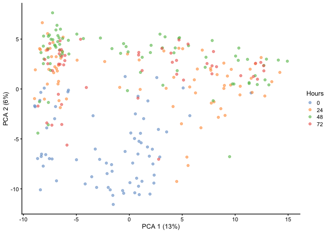
Principal Component Analysis
First, let’s run a PCA and visualize it to see if we can delineate the
different cell states. Here we have Hours as our cell state metadata.
As you can see, time does not separate very well within PC1 and PC2 as
there is still overlap.
HSMM <- runPCA(HSMM, ncomponents = 50)
plotReducedDim(HSMM, dimred="PCA", colour_by="Hours")
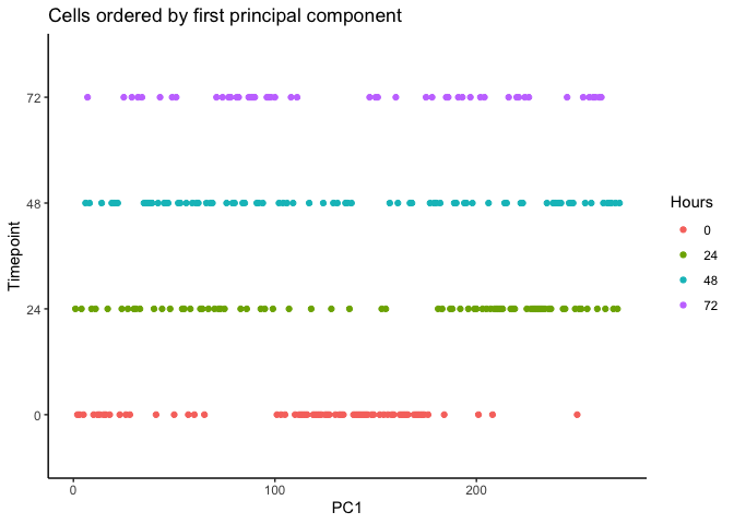
We can order each cell using the first principal component. The result
appear to be flipped which could be resolved using rev().
pca <- reducedDim(HSMM, type = 'PCA')

HSMM$pseudotime_PC1 <- rank(pca[,1])
ggplot(as.data.frame(colData(HSMM)), aes(x = pseudotime_PC1, y = Hours,
                                             colour = Hours)) +
    geom_point() + theme_classic() +
    xlab("PC1") + ylab("Timepoint") +
    ggtitle("Cells ordered by first principal component")
Diffusion Mapping
Haghverdi et al. developed a method called ‘Diffusion Maps’ to infer the temporal order of differentiating cells by modeling it as a diffusion process. Diffusion maps is a nonlinear method that could better resolve complex trajectories and branching than linear methods such as PCA. This method has been implemented in the R packaged destiny.
library(destiny)
##
## Attaching package: 'destiny'

## The following object is masked from 'package:SummarizedExperiment':
##
##     distance

## The following object is masked from 'package:GenomicRanges':
##
##     distance

## The following object is masked from 'package:IRanges':
##
##     distance
matrix <- assay(HSMM, i = 'logcounts') #  Prepare a counts matrix with labeled rows and columns.

dm <- DiffusionMap(t(matrix), n_pcs = 50) # Make a diffusion map.
reducedDim(HSMM, type = 'DC') <- dm@eigenvectors
plotReducedDim(HSMM, dimred="DC", colour_by="Hours")
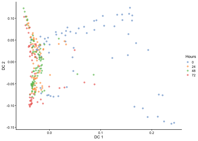
As you can see, the temporal ordering of the cells is better resolved in the diffusion map as opposed to PCA. In addition, it looks like there are two terminal branches which actually reflects the outcome from the original article. Next, we can try ordering the cells like we did before by ranking the eigenvectors and seeing if the cells separate based on time.
HSMM$pseudotime_diffusionmap <- rank(eigenvectors(dm)[,1])   # rank cells by their dpt
ggplot(as.data.frame(colData(HSMM)),
       aes(x = pseudotime_diffusionmap,
           y = Hours, color = Hours)) + geom_point() + theme_classic() +
    xlab("Diffusion component 1 (DC1)") + ylab("Timepoint") +
    ggtitle("Cells ordered by DC1")
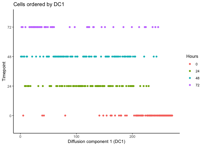
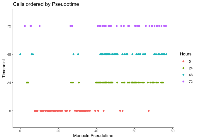
It looks like we can at least resolve the earliest time-point (0 hours) and there is some separation with the final time-point (72 hours). Let’s compare with the original pseudotime by Trapnell et al.
ggplot(as.data.frame(colData(HSMM)),
       aes(x = Pseudotime,
           y = Hours, color = Hours)) + geom_point() + theme_classic() +
    xlab("Monocle Pseudotime") + ylab("Timepoint") +
    ggtitle("Cells ordered by Pseudotime")
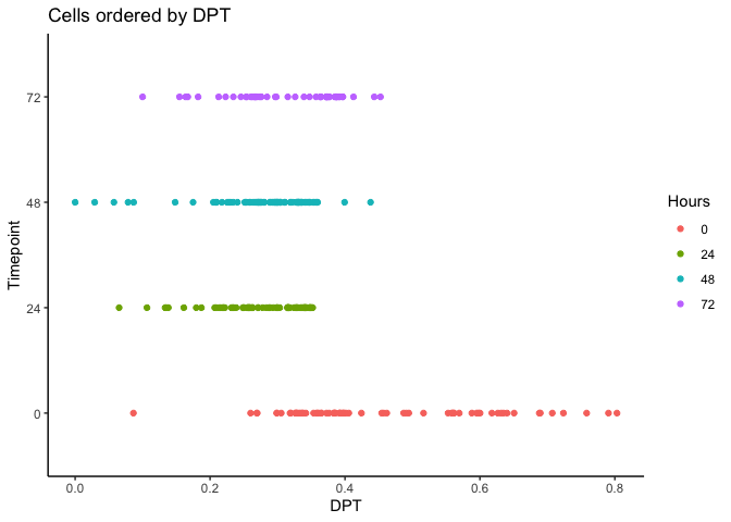
Now let’s calculate the Diffusion Pseudotime (DPT) by setting the first ranked cell as the root cell.
index <- 1:length(HSMM$pseudotime_diffusionmap)
dpt <- DPT(dm, tips = index[HSMM$pseudotime_diffusionmap == 1])
HSMM$dpt <- dpt$dpt

ggplot(as.data.frame(colData(HSMM)),
       aes(x = dpt,
           y = Hours, color = Hours)) + geom_point() + theme_classic() +
    xlab("DPT") + ylab("Timepoint") +
    ggtitle("Cells ordered by DPT")
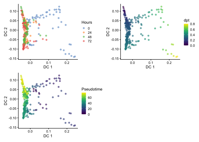
Visualizing Pseudotime
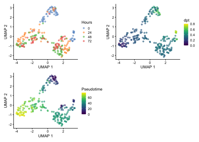
Here we can compare between Hours, dpt, and Pseudotime on the
diffusion map embedding.
library(patchwork)
p1 <- plotReducedDim(HSMM, dimred="DC", colour_by="Hours")
p2 <- plotReducedDim(HSMM, dimred="DC", colour_by="dpt")
p3 <-plotReducedDim(HSMM, dimred="DC", colour_by="Pseudotime")
p1 + p2 + p3 + plot_layout(nrow=2)
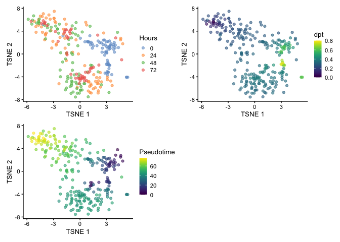
We can also use t-stochastic neighbor embedding (t-SNE) for visualization. You can see the branching but the large spread of cells makes it challenging to identify the terminal points.
set.seed(42)
HSMM <- runTSNE(HSMM, dimred='PCA')

p1 <- plotReducedDim(HSMM, dimred="TSNE", colour_by="Hours")
p2 <- plotReducedDim(HSMM, dimred="TSNE", colour_by="dpt")
p3 <-plotReducedDim(HSMM, dimred="TSNE", colour_by="Pseudotime")
p1 + p2 + p3 + plot_layout(nrow=2)
When visualizing by UMAP, we start seeing separation of clusters which suggests that there may be two root cells within the population and that could explain the reasoning for the two terminal points that was identified by Trapnell et al. and we observed using the diffusion map.
set.seed(42)
HSMM <- runUMAP(HSMM, dimred='PCA')

p1 <- plotReducedDim(HSMM, dimred="UMAP", colour_by="Hours")
p2 <- plotReducedDim(HSMM, dimred="UMAP", colour_by="dpt")
p3 <-plotReducedDim(HSMM, dimred="UMAP", colour_by="Pseudotime")
p1 + p2 + p3 + plot_layout(nrow=2)
Gene Expression Trends
We can observe gene expression trends as a function of dpt. Analyzing
gene expression trends are important in understanding the genes that
regulate development of differentiation. First, we load libraries that
will help us re-map from Ensembl to Official Symbol.
library(AnnotationDbi)
##
## Attaching package: 'AnnotationDbi'

## The following object is masked from 'package:dplyr':
##
##     select
library(org.Hs.eg.db)
##
library(EnsDb.Hsapiens.v86)
## Loading required package: ensembldb

## Warning: package 'ensembldb' was built under R version 4.0.5

## Loading required package: GenomicFeatures

## Warning: package 'GenomicFeatures' was built under R version 4.0.4

## Loading required package: AnnotationFilter

##
## Attaching package: 'ensembldb'

## The following object is masked from 'package:dplyr':
##
##     filter

## The following object is masked from 'package:stats':
##
##     filter
matrix <- assay(HSMM, i = 'logcounts')

Ensembl_id <- rownames(matrix)
Ensembl_id <- sapply(strsplit(Ensembl_id, split="[.]"), "[[", 1)
head(Ensembl_id)
## [1] "ENSG00000000003" "ENSG00000000005" "ENSG00000000419" "ENSG00000000457"
## [5] "ENSG00000000460" "ENSG00000000938"
gene_ids <- ensembldb::select(EnsDb.Hsapiens.v86, keys = Ensembl_id, keytype = 'GENEID', columns = 'SYMBOL')
rownames(matrix) <- Ensembl_id
matrix <- matrix[gene_ids$GENEID,]
rownames(matrix) <- gene_ids$SYMBOL
head(rownames(matrix))
## [1] "TSPAN6" "TNMD" "DPM1" "SCYL3" "C1orf112" "FGR"
We will investigate the same genes that Trapnell et al. used in their
article. First, we will generate a data frame that organizes the genes
and metadata for ggplot2.
require(tidyr)
gene <- c('CDK1', 'ID1', 'MKI67', 'MYOG') #You can modify this list to whichever genes you want
expr_matrix <- as.data.frame(t(rbind(matrix[gene,, drop = FALSE], dpt = HSMM$dpt, Hours = as.character(HSMM$Hours), Pseudotime = HSMM$Pseudotime)))

df <- pivot_longer(expr_matrix, gene, names_to = 'feature', values_to = 'expr')
## Note: Using an external vector in selections is ambiguous.
## ℹ Use `all_of(gene)` instead of `gene` to silence this message.
## ℹ See <https://tidyselect.r-lib.org/reference/faq-external-vector.html>.
## This message is displayed once per session.
df$expr <- as.numeric(as.character(df$expr)) #Some of the columns changed to characters after `pivot_longer` for some reason.
df$dpt <- as.numeric(as.character(df$dpt))
df$Pseudotime <- as.numeric(as.character(df$Pseudotime))
df$Time <- as.numeric(as.character(df$Hours)) #Generated a separate column for plotting purposes.
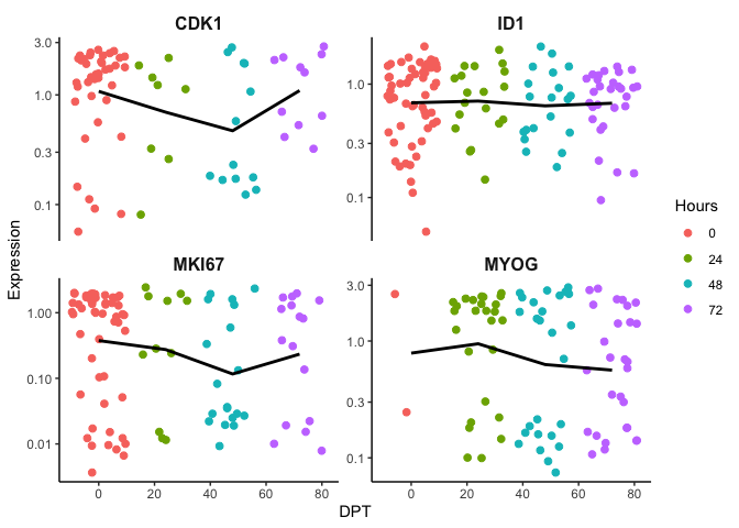
To put it into perspective, we first order the cells based on time and you can see there gene expression trend is difficult to resolve. We expect an increase of MYOG over time but the trend line is flat. As discussed earlier, time as a measure of biological progress may not be adequate since not all cells start at time 0. In other words, they are not in synchrony. Ordering cells by pseudotime should resolve this and enable a measurement of biological progression regardless if cells are in different cell states.
require(ggplot2)
p <- ggplot(df, mapping = aes(x=Time, y=expr, color=Hours)) + geom_jitter(size=2) + theme_classic() + xlab('DPT') + ylab('Expression') + theme(plot.title = element_text(size=16, hjust =  0.5, face = 'bold'), strip.text = element_text(size=12, face = 'bold'),strip.background = element_rect(size = 0)) + guides(color = guide_legend(override.aes = list(linetype = 'blank'))) + scale_y_log10() + facet_wrap(~feature,scales = "free_y")
p + stat_summary(fun.y=mean, colour="black", geom="line", size = 1)
## Warning: `fun.y` is deprecated. Use `fun` instead.

## Warning: Transformation introduced infinite values in continuous y-axis

## Warning: Transformation introduced infinite values in continuous y-axis

## Warning: Removed 708 rows containing non-finite values (stat_summary).

## Warning: Removed 708 rows containing missing values (geom_point).
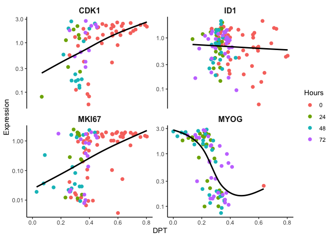
Here the cells are ordered by dpt and we can observe the expected gene
expression trends.
p <- ggplot(df, mapping = aes(x=dpt, y=expr, color=Hours)) + geom_jitter(size=2) + theme_classic() + xlab('DPT') + ylab('Expression') + theme(plot.title = element_text(size=16, hjust =  0.5, face = 'bold'), strip.text = element_text(size=12, face = 'bold'),strip.background = element_rect(size = 0)) + guides(color = guide_legend(override.aes = list(linetype = 'blank'))) + scale_y_log10() + facet_wrap(~feature,scales = "free_y")
p + geom_smooth(aes(color = expr), method = 'gam', se=F, color = 'black')
## Warning: Transformation introduced infinite values in continuous y-axis

## Warning: Transformation introduced infinite values in continuous y-axis

## `geom_smooth()` using formula 'y ~ s(x, bs = "cs")'

## Warning: Removed 708 rows containing non-finite values (stat_smooth).

## Warning: Removed 708 rows containing missing values (geom_point).
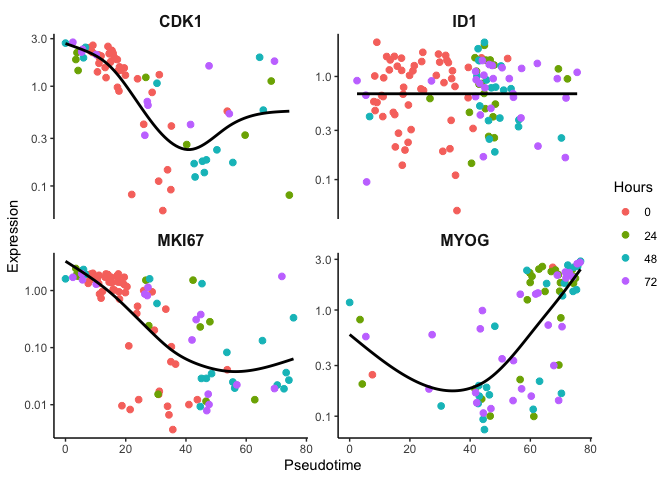
Likewise, we can look at the original Pseudotime and observe fairly
the same gene expression trends.
p <- ggplot(df, mapping = aes(x=Pseudotime, y=expr, color=Hours)) + geom_jitter(size=2) + theme_classic() + xlab('Pseudotime') + ylab('Expression') + theme(plot.title = element_text(size=16, hjust =  0.5, face = 'bold'), strip.text = element_text(size=12, face = 'bold'),strip.background = element_rect(size = 0)) + guides(color = guide_legend(override.aes = list(linetype = 'blank'))) + scale_y_log10() + facet_wrap(~feature,scales = "free_y")
p + geom_smooth(aes(color = expr), method = 'gam', se=F, color = 'black')
## Warning: Transformation introduced infinite values in continuous y-axis

## Warning: Transformation introduced infinite values in continuous y-axis

## `geom_smooth()` using formula 'y ~ s(x, bs = "cs")'

## Warning: Removed 708 rows containing non-finite values (stat_smooth).

## Warning: Removed 708 rows containing missing values (geom_point).
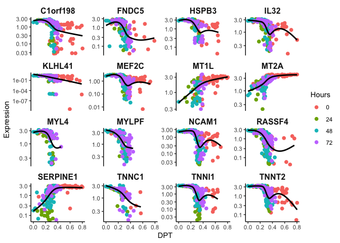
Identifying Temporally-regulated Genes
Let’s take it a step further and find significant genes that change with
dpt. Here we employ a Generalized Additive Model to model non-linear
changes in the the gene expression trend.
require(gam)
## Loading required package: gam

## Loading required package: splines

## Loading required package: foreach

## Loaded gam 1.20
t <- HSMM$dpt
var1K <- names(sort(apply(matrix, 1, var),decreasing = TRUE))[1:100] #We select the top variable genes to speed up the calculations. You are more than welcome to use all genes.
matrix <- matrix[var1K, ]

# fit a GAM using a spline
gam.pval <- apply(matrix,1,function(z){
    d <- data.frame(z=z, t=t)
    suppressWarnings({
      tmp <- suppressWarnings(gam(z ~ s(t), data=d))
    })
    p <- summary(tmp)[4][[1]][1,5]
    p
})

topgenes <- sort(gam.pval, decreasing = FALSE)[1:16] #selecting top 16 genes that are temporally expressed
topgenes <- topgenes[topgenes<0.05] %>% names() #filter for p < 0.05

expr_matrix <- as.data.frame(t(rbind(matrix[topgenes,, drop = FALSE], dpt = HSMM$dpt, Hours = as.character(HSMM$Hours))))

df <- pivot_longer(expr_matrix, topgenes, names_to = 'feature', values_to = 'expr')
## Note: Using an external vector in selections is ambiguous.
## ℹ Use `all_of(topgenes)` instead of `topgenes` to silence this message.
## ℹ See <https://tidyselect.r-lib.org/reference/faq-external-vector.html>.
## This message is displayed once per session.
df$expr <- as.numeric(as.character(df$expr)) #Some of the columns changed to characters after `pivot_longer` for some reason.
df$dpt <- as.numeric(as.character(df$dpt))

p <- ggplot(df, mapping = aes(x=dpt, y=expr, color=Hours)) + geom_jitter(size=2) + theme_classic() + xlab('DPT') + ylab('Expression') + theme(plot.title = element_text(size=16, hjust =  0.5, face = 'bold'), strip.text = element_text(size=12, face = 'bold'),strip.background = element_rect(size = 0)) + guides(color = guide_legend(override.aes = list(linetype = 'blank'))) + scale_y_log10() + facet_wrap(~feature,scales = "free_y")
p + geom_smooth(aes(color = expr), method = 'gam', se=F, color = 'black')
## Warning: Transformation introduced infinite values in continuous y-axis

## Warning: Transformation introduced infinite values in continuous y-axis

## `geom_smooth()` using formula 'y ~ s(x, bs = "cs")'

## Warning: Removed 1279 rows containing non-finite values (stat_smooth).

## Warning: Removed 1279 rows containing missing values (geom_point).
Additional Resources
There are additional R libraries that I won’t demonstrate here but feel free to explore them. Descriptions are from their websites. More complex data sets will have multiple trajectories and branches that could be better analyzed with the following packages.
- Monocle 3: Single-cell transcriptome sequencing (sc-RNA-seq) experiments allow us to discover new cell types and help us understand how they arise in development. The Monocle 3 package provides a toolkit for analyzing single-cell gene expression experiments.
- TSCAN: TSCAN enables users to easily construct and tune pseudotemporal cell ordering as well as analyzing differentially expressed genes. TSCAN comes with a user-friendly GUI written in shiny. More features will come in the future.
- slingshot: Provides functions for inferring continuous, branching lineage structures in low-dimensional data. Slingshot was designed to model developmental trajectories in single-cell RNA sequencing data and serve as a component in an analysis pipeline after dimensional reduction and clustering. It is flexible enough to handle arbitrarily many branching events and allows for the incorporation of prior knowledge through supervised graph construction.