
K-means from scratch in R
K-means is an unsupervised machine learning clustering algorithm. It can be used to cluster a set of observations based on similarity between the observations. K-means is one of the most popular clustering technique and it is quite simple to understand.
K-means clustering algorithm
The goal of this algorithm is to the find the optimal division of n
observations into k clusters, so that the total squared distance of
the group members to the cluster centroid is minimized.
- $x_i$ is an observation assigned to cluster $C_k$
- $\mu_k$ is the mean value of all observations assigned to cluster $C_k$ (i.e, the centroid)
The K-means algorithm attempts to do the follow:
- Initialize
knumber of clusters. knumber of observations are randomly selected to be the initial centroids.- Determine the distance between observations and the centroids. This can be done by a variety of distance metrics. A common one is the Euclidean distance.
- Assign each observation to the nearest centroid.
- Recalculate new centroid position. This is done by updating the centroid coordinates by taking the average of all values of each observations that are part of the cluster.
- Steps 3 - 5 are repeated iteratively until a maximum number of iterations are reached or the observations no longer assigned to another cluster.
Computing k-means Clustering
We can develop a simple K-means function using the above algorithm. Here
we have a data set USArrests, which contains statistics for arrests
per 100,000 residents in each state for either murder, assault, or rape.
In addition, the percentage of people living in urban areas is also
listed.
library(ggplot2)
library(dplyr)
##
## Attaching package: 'dplyr'

## The following objects are masked from 'package:stats':
##
##     filter, lag

## The following objects are masked from 'package:base':
##
##     intersect, setdiff, setequal, union
library(tidyr)

data("USArrests")
head(USArrests)
##            Murder Assault UrbanPop Rape
## Alabama      13.2     236       58 21.2
## Alaska       10.0     263       48 44.5
## Arizona       8.1     294       80 31.0
## Arkansas      8.8     190       50 19.5
## California    9.0     276       91 40.6
## Colorado      7.9     204       78 38.7
The data is then scaled to standardize the values.
USArrests_scaled <- scale(USArrests)
head(USArrests_scaled)
##                Murder   Assault   UrbanPop         Rape
## Alabama    1.24256408 0.7828393 -0.5209066 -0.003416473
## Alaska     0.50786248 1.1068225 -1.2117642  2.484202941
## Arizona    0.07163341 1.4788032  0.9989801  1.042878388
## Arkansas   0.23234938 0.2308680 -1.0735927 -0.184916602
## California 0.27826823 1.2628144  1.7589234  2.067820292
## Colorado   0.02571456 0.3988593  0.8608085  1.864967207
We can use principal component analysis to generate a low-dimensional representation of the graph.
pca_USArrests <- prcomp(USArrests_scaled, scale. = F)
pca_USArrests_df <- as.data.frame(pca_USArrests$x) %>%
  dplyr::select(PC1, PC2) %>%
  cbind(States = rownames(USArrests))

ggplot(pca_USArrests_df, aes(x = PC1, y = PC2)) +
  geom_text(aes(label = States)) +
  theme_classic()
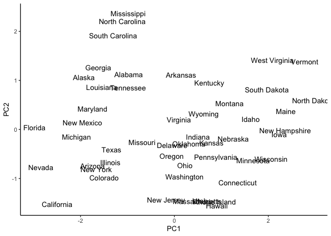
We can already see possible clusters or grouping of states with similar
statistics. Let’s start with an easy k value of 2. We initialize k
and select for centroids.
k = 2
centroids = sample.int(dim(USArrests_scaled)[1], k) #randomly select k integers from 1 to the length of the data.
centroid_points = USArrests_scaled[centroids,] %>% as.matrix() #use the selected integers as indices and select for them in the data frame.
centroid_points
##               Murder    Assault   UrbanPop      Rape
## Oregon    -0.6630682 -0.1411127  0.1008652 0.8613783
## Tennessee  1.2425641  0.2068693 -0.4518209 0.6051428
Next, we use a distance metric to compare the observation and the centroids. This will result in a matrix that gauges dissimilarity. Observations that are further apart from the centroid and less likely to be part of that cluster. Choice of distance metric will affect the formation of the clusters. Here we choose the Euclidean distance:
\[d_{euc}(x,y) =\sqrt{\Sigma_{i=1}^{n}(x_i-y_i)^2}\]-
$n$ is the number of observations
-
$y_i$ is the value of the centroid
dataPoints <- as.matrix( USArrests_scaled)
dist_mat <- matrix(0, nrow = nrow(dataPoints), ncol = k) #initialize an empty matrix
for (j in 1:k)
  {
    for (i in 1:nrow(dataPoints))
    {
    dist_mat[i,j] = sqrt(sum((dataPoints[i,1:ncol(dataPoints)] - centroid_points[j,1:ncol(centroid_points)])^2))
    }
  }
head(dist_mat)
##          [,1]      [,2]
## [1,] 2.370568 0.8407489
## [2,] 2.699070 2.3362541
## [3,] 2.000866 2.2989846
## [4,] 1.847763 1.4254486
## [5,] 2.657402 3.0119267
## [6,] 1.533198 2.1972111
The cluster for each observation is chosen by the centroid with the
smallest distance to the observation. We can use the which.min()
function.
cluster = factor(apply(dist_mat, 1, which.min)) #selects the column index with the smallest distance
head(cluster)
## [1] 2 2 1 2 1 1
## Levels: 1 2
Recall that we are minimizing the squared Euclidean distances between the observation and the assigned centroid. This is also the within-cluster sum of squares (WCSS).
\[W(C_k) =\Sigma_{x_i\in C_k}(x_i-\mu_k)^2\]We define a total within-cluster sum of squares (total_WCSS) which measures the compactness of the clustering. Minimizing this value results in tighter clusters.
\[totalWCSS =\Sigma^k_{k=1}W(C_k) =\Sigma^k_{k=1}\Sigma_{x_i\in C_k}(x_i-\mu_k)^2\]dist_mat_cluster <- list()
for(i in 1:k){
dist_mat_cluster[[i]] <- dist_mat[which(cluster == i),i]^2
}
within_cluster_ss <- unlist(lapply(dist_mat_cluster, sum))
cat('Within-cluster sum of squares:')
## Within-cluster sum of squares:
within_cluster_ss
## [1] 133.74617 54.87014
total_WCSS = sum(within_cluster_ss)
cat('\nTotal within-cluster sum of squares:', total_WCSS)
##
## Total within-cluster sum of squares: 188.6163
Using the PCA graph, we can observe how our clusters look and where the initial centroids are located.
pca_USArrests_df <- as.data.frame(pca_USArrests$x) %>%
  dplyr::select(PC1, PC2) %>%
  cbind(States = rownames(USArrests)) %>%
  cbind(Clusters = cluster)

centroid_points_unscaled <- apply(centroid_points, 1,  function(x)
  { x * pca_USArrests$scale + pca_USArrests$center}) %>% t()
rownames(centroid_points_unscaled) <- c(1:k)

centroid_coord <- predict(pca_USArrests, centroid_points_unscaled) %>% as.data.frame() # adding the centroid coordinates

ggplot(pca_USArrests_df, aes(x = PC1, y = PC2,)) +
  geom_text(aes(label = States, color = Clusters)) + # labeling the centroids
  geom_point(data =  centroid_coord,
             mapping =  aes(x = PC1, y = PC2,  color = rownames(centroid_coord)),
             size = 3)  +
  theme_classic()
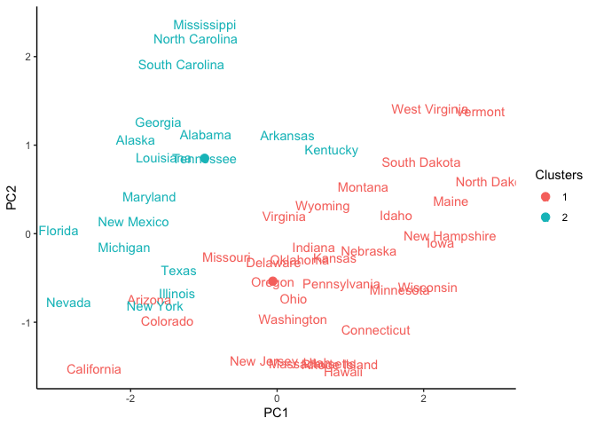
As you can see, the clustering is not that great since we have only
initialized the algorithm and had randomly selected k observations as
centroids. The next step is to form new centroids and iteratively assign
observations to clusters until a maximum number of iterations are
reached or the observations no longer assigned to another cluster.
We can generate new centroid values by taking the mean of all values of each observations that are part of the cluster
new_centroid = USArrests_scaled %>%
  as.data.frame() %>%
  cbind(Clusters = cluster) %>%
  group_by(Clusters) %>%
  summarise_all(mean)
new_centroid
## # A tibble: 2 × 5
##   Clusters Murder Assault UrbanPop   Rape
##   <fct>     <dbl>   <dbl>    <dbl>  <dbl>
## 1 1        -0.629  -0.517   0.0620 -0.328
## 2 2         1.12    0.919  -0.110   0.584
centroid_points = new_centroid[,-1] %>% as.matrix()
Creating a k-means function
Rather than repeating the code over and over, we can write a function that will do it for us.
k_means_ <- function(df, k, iters){
  #initialize random centroids
  centroids = sample.int(dim(df)[1], k)
  centroid_points = df[centroids,] %>% as.matrix()
  dataPoints <- as.matrix(df)

  #initialize WCSS
  within_cluster_ss <- c()

  for (i in 1:iters){
    dist_mat <- matrix(0, nrow = nrow(dataPoints), ncol = k)
    for (j in 1:k)
      {
        for (i in 1:nrow(dataPoints))
        {
        dist_mat[i,j] = sqrt(sum((dataPoints[i,1:ncol(dataPoints)] - centroid_points[j,1:ncol(centroid_points)])^2))
        }
      }

    cluster = factor(apply(dist_mat, 1, which.min))
    dist_mat_cluster <- list()
    for(i in 1:k){
      dist_mat_cluster[[i]] <- dist_mat[which(cluster == i),i]^2
    }

    within_cluster_ss_temp <- unlist(lapply(dist_mat_cluster, sum))
    within_cluster_ss <- append(within_cluster_ss, within_cluster_ss_temp)


    new_centroid = df %>%
    as.data.frame() %>%
    cbind(Clusters = cluster) %>%
    group_by(Clusters) %>%
    summarise_all(mean)
    centroid_points = new_centroid[,-1] %>% as.matrix()
  }
  within_cluster_ss <- t(array(within_cluster_ss, dim = c(k, iters)))
  return(list(Cluster = cluster,
              WCSS = within_cluster_ss))
}
We use the same parameters as before and pass our variables into our new
function k_means_()`.
iters = 10
k = 2
USArrests_scaled <- scale(USArrests)

k_means <- k_means_(USArrests_scaled, k, iters)
k_means
## $Cluster
##  [1] 2 2 2 1 2 2 1 1 2 2 1 1 2 1 1 1 1 2 1 2 1 2 1 2 2 1 1 2 1 1 2 2 2 1 1 1 1 1
## [39] 1 2 1 2 2 1 1 1 1 1 1 1
## Levels: 1 2
##
## $WCSS
##            [,1]     [,2]
##  [1,] 147.75655 82.14443
##  [2,]  64.39358 50.06885
##  [3,]  56.22017 46.82608
##  [4,]  56.11445 46.74796
##  [5,]  56.11445 46.74796
##  [6,]  56.11445 46.74796
##  [7,]  56.11445 46.74796
##  [8,]  56.11445 46.74796
##  [9,]  56.11445 46.74796
## [10,]  56.11445 46.74796
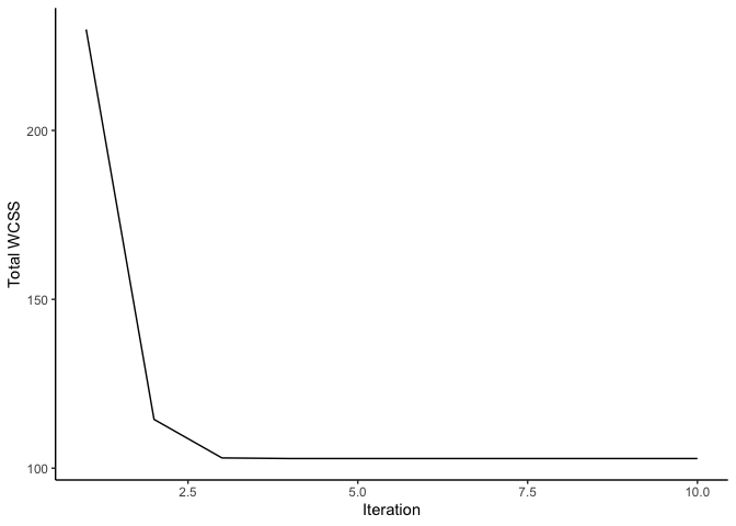
The total WCSS is minimized after reaching the maximum iterations.
df <- rowSums(k_means$WCSS) %>%
  as.data.frame() %>%
  cbind(iter = c(1:iters))

ggplot(df, aes(y =., x = iter)) +
  geom_line() + labs(x = 'Iteration', y =  'Total WCSS') +
  theme_classic()
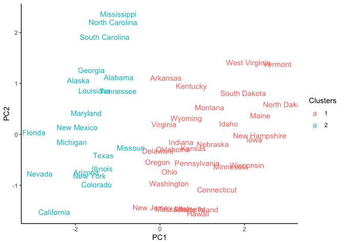
Using the PCA graph, we can observe how our clusters look after reaching the maximum number of iterations.
pca_USArrests_df <- as.data.frame(pca_USArrests$x) %>%
  dplyr::select(PC1, PC2) %>%
  cbind(States = rownames(USArrests)) %>%
  cbind(Clusters = k_means$Cluster)

ggplot(pca_USArrests_df, aes(x = PC1, y = PC2)) +
  geom_text(aes(label = States, color = Clusters))  +
  theme_classic()
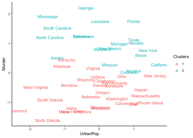
We can also observe the clustering with a scatter plot of two features
like UrbanPop and Murder.
USArrests_df <- USArrests_scaled %>%
  as.data.frame() %>%
  cbind(States = rownames(USArrests)) %>%
  cbind(Clusters = k_means$Cluster)

ggplot(USArrests_df, aes(x = UrbanPop, y = Murder,)) +
  geom_text(aes(label = States, color = Clusters)) +
  theme_classic()
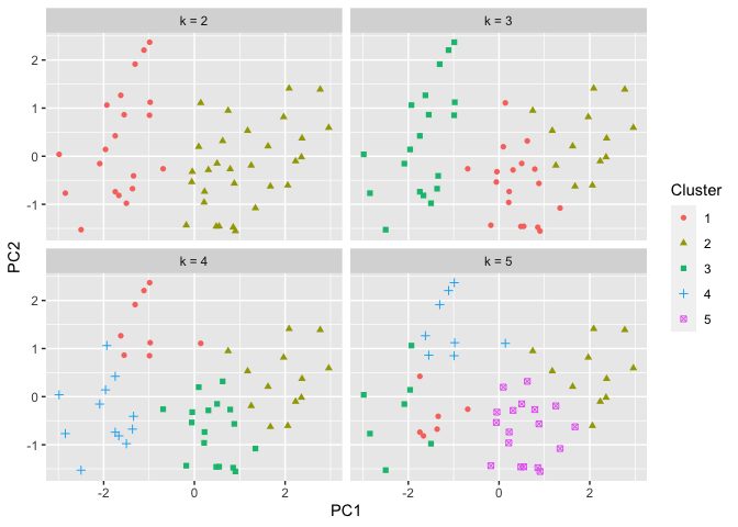
Determining the optimal number of clusters
Initially, we looked at 2 possible clusters. We can test out different
numbers for k. Let’s repeat the process but with 2,3,4, and 5
clusters. The results are below:
k_means_test <- lapply(c(2:5), function(k) {k_means_(USArrests_scaled, k, iters)})
cluster_list <- lapply(k_means_test, function(x) x[[1]])
names(cluster_list) <- paste('k =',c(2:5))

cluster_list_df <- do.call(cbind, cluster_list)

pca_USArrests_df <- as.data.frame(pca_USArrests$x) %>%
  dplyr::select(PC1, PC2) %>%
  cbind(States = rownames(USArrests)) %>%
  cbind(cluster_list_df) %>%
  pivot_longer(cols = names(cluster_list))

ggplot(pca_USArrests_df, aes(x = PC1, y = PC2)) + geom_point(aes(shape = factor(value), color = factor(value))) + facet_wrap(~name) + labs(color  = "Cluster", shape = "Cluster")
Of course we can continue testing additional values of k. However, it
may be more advantageous to determine the optimal k value based on the
total within-cluster sum of squares. Recall that this value must be
minimized to find the optimal cluster assignments. We can also use this
to determine the optimal k.
- Compute the k-means cluster for different values for
k. For instance, we can varykfrom 1 to 10. - For each value of
k, the total within-cluster sum of squares. - Plot the the total within-cluster sum of squares against each value
of
k. - Determine the location of a bend in the plot. This typically
indicates the optimal value for
k.
k_means_test <- lapply(c(1:10), function(k) {k_means_(USArrests_scaled, k, iters)})
WCSS_list <- lapply(k_means_test, function(x) x[[2]][iters,])
total_WCSS_list <- lapply(WCSS_list, sum)

df <- data.frame(Y = unlist(total_WCSS_list), X = c(1:10))

ggplot(df, aes(x = X, y = Y)) +
  geom_line() +
  geom_point() +
  labs(x = 'k clusters', y = 'Total WCSS') +
  scale_x_continuous(breaks = c(1:10)) +
  theme_classic()
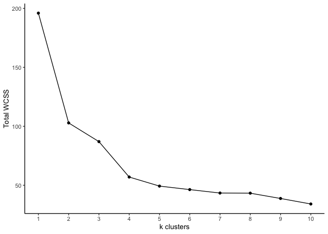
The optimal k look to be either 4 or 5. As you can see, k-means
clustering is simple and quick. One caveat is choosing the number of
clusters. Another is the random initialization of centroids. This could
slow down the algorithm in very large data sets. One possible
improvement is to generate different initial centroids and select the
set that has the smallest total within-cluster sum of squares.