
Principal Component Analysis
Principal Component Analysis
In this post, I will be discussing Principal Component Analysis (PCA) and how it can be used in data sets to understand variation with many different variables. Many real-world data sets are often in high dimensions. In other words, they contain so many variables that it is difficult to distinguish a trend.
PCA is a type of dimensional reduction method that can assist us by identifying which variables contribute to the variation within the data. It is similar to fitting a best fit line onto a 2D graph, but in this case there may be more than three-dimensions of data. It is formulated in the language of linear algebra and is an often used technique in data science and bioinformatics.
library(ggplot2)
library(cowplot) # required to arrange multiple plots in a grid
library(dplyr)
##
## Attaching package: 'dplyr'

## The following objects are masked from 'package:stats':
##
##     filter, lag

## The following objects are masked from 'package:base':
##
##     intersect, setdiff, setequal, union
Exploring the data
We will be using the often cited iris data set. As you can see, there
are more than five dimensions of data.
head(iris)
##   Sepal.Length Sepal.Width Petal.Length Petal.Width Species
## 1          5.1         3.5          1.4         0.2  setosa
## 2          4.9         3.0          1.4         0.2  setosa
## 3          4.7         3.2          1.3         0.2  setosa
## 4          4.6         3.1          1.5         0.2  setosa
## 5          5.0         3.6          1.4         0.2  setosa
## 6          5.4         3.9          1.7         0.4  setosa
Let us try to observe some patterns with different combinations of variables.
p1 <- ggplot(iris, aes(x=Sepal.Length, y=Sepal.Width, color=Species)) + geom_point()
p2 <- ggplot(iris, aes(x=Sepal.Length, y=Petal.Length, color=Species)) + geom_point()
p3 <- ggplot(iris, aes(x=Petal.Length, y=Petal.Width, color=Species)) + geom_point()
p4 <- ggplot(iris, aes(x=Sepal.Width, y=Petal.Width, color=Species)) + geom_point()
plot_grid(p1, p2, p3, p4, labels = "AUTO")
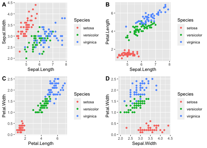
As you can see from the graphs, petal length, petal width, and perhaps sepal length contribute the most to the differences between the three species.
Using PCA
Let’s try using PCA as a better method for detecting such patterns.
First, we will only include numerical data. We will pass our data set
(excluding the Species column) into the function prcomp. center and
scale will be set to true to scale the data to 0 mean and unit
variance.
iris.pca <- prcomp(iris[,1:4], center = TRUE, scale. = TRUE)
summary(iris.pca)
## Importance of components:
##                           PC1    PC2     PC3     PC4
## Standard deviation     1.7084 0.9560 0.38309 0.14393
## Proportion of Variance 0.7296 0.2285 0.03669 0.00518
## Cumulative Proportion  0.7296 0.9581 0.99482 1.00000
The main results are that Principal Components 1 and 2 explains the majority of the variance within the data set. These values are derived from the eigenvectors and eigenvalues from the covariance matrix.
To better understand, you will need a basic understanding of eigenvectors and eigenvalues. To simply put, an eigenvector is a vector whose direction remains unchanged after a linear transformation. In that regard, an eigenvector provides direction or orientation of the data, like 90 or 45 degrees. The change after a linear transformation is described as the eigenvalue. In other words, the variance or spread of the data is explained by the eigenvalue. In addition, an n-th dimensional matrix will have the same n eigenvectors/eigenvalues. Therefore, each principal component is an eigenvector and PC1 has the highest eigenvalue (highest variance).
We can observe the results of the linear transformation with
iris.pca$x.
head(iris.pca$x)
##            PC1        PC2         PC3          PC4
## [1,] -2.257141 -0.4784238  0.12727962  0.024087508
## [2,] -2.074013  0.6718827  0.23382552  0.102662845
## [3,] -2.356335  0.3407664 -0.04405390  0.028282305
## [4,] -2.291707  0.5953999 -0.09098530 -0.065735340
## [5,] -2.381863 -0.6446757 -0.01568565 -0.035802870
## [6,] -2.068701 -1.4842053 -0.02687825  0.006586116
Let’s add back in the species data.
pca_data <- data.frame(iris.pca$x, Species=iris$Species)
head(pca_data)
##         PC1        PC2         PC3          PC4 Species
## 1 -2.257141 -0.4784238  0.12727962  0.024087508  setosa
## 2 -2.074013  0.6718827  0.23382552  0.102662845  setosa
## 3 -2.356335  0.3407664 -0.04405390  0.028282305  setosa
## 4 -2.291707  0.5953999 -0.09098530 -0.065735340  setosa
## 5 -2.381863 -0.6446757 -0.01568565 -0.035802870  setosa
## 6 -2.068701 -1.4842053 -0.02687825  0.006586116  setosa
Next, we will plot the first two principal components as these would explain the highest variation within the data.
ggplot(pca_data, aes(x=PC1, y=PC2, color=Species)) + geom_point()
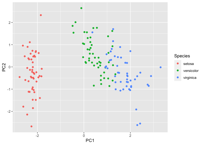
We can observe that setosa separates further from versicolor and
virginica. To understand which variables contribute to this variation in
the data, we will call iris.pca$rotation.
iris.pca$rotation
##                     PC1         PC2        PC3        PC4
## Sepal.Length  0.5210659 -0.37741762  0.7195664  0.2612863
## Sepal.Width  -0.2693474 -0.92329566 -0.2443818 -0.1235096
## Petal.Length  0.5804131 -0.02449161 -0.1421264 -0.8014492
## Petal.Width   0.5648565 -0.06694199 -0.6342727  0.5235971
Here we can see that Sepal.Length, Petal.Length, and Petal.Width
contributes quite a bit to PC1 compared to Sepal.Width. However,
Sepal.Width contributes greatly to PC2.
Therefore, based on the above graph, we can infer that variance in the
x-axis is due to Sepal.Length, Petal.Length, and Petal.Width and
variance in the y-axis is due to Sepal.Width. Running the following
code will show this concept as vectors.
# capture the rotation matrix in a data frame
rotation_data <- data.frame(iris.pca$rotation, variable=row.names(iris.pca$rotation))
# define a pleasing arrow style
arrow_style <- arrow(length = unit(0.05, "inches"),
                     type = "closed")
# now plot, using geom_segment() for arrows and geom_text for labels
ggplot(rotation_data) +
  geom_segment(aes(xend=PC1, yend=PC2), x=0, y=0, arrow=arrow_style) +
  geom_text(aes(x=PC1, y=PC2, label=variable), hjust=0, size=3, color='blue') +
  xlim(-1.,1.25) +
  ylim(-1.,1.) +
  coord_fixed() # fix aspect ratio to 1:1
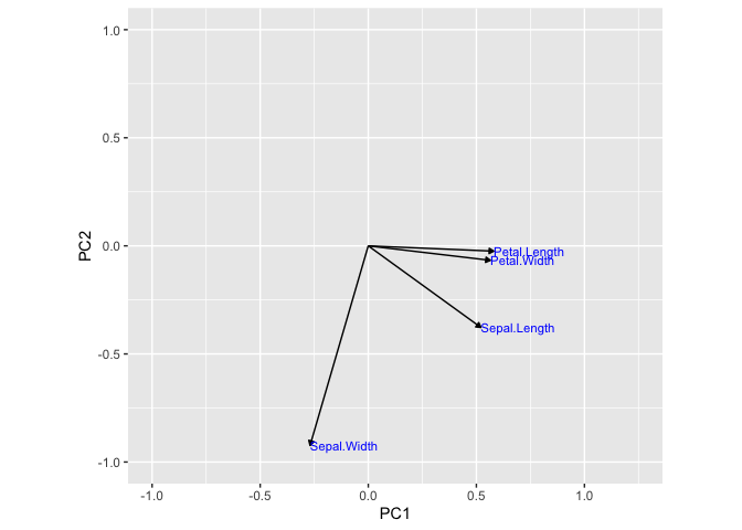
As you can see, before performing a PCA, we used four graphs to observe the conclusion that petal length, petal width, and sepal length contributed the most to the variance in species. With PCA, we could easily observe this with the PCA plot of PC1 vs PC2. In addition, we used a simple dataset to illustrate this. Many real-world data sets consists of much higher dimensions.