Exploratory Data Analysis in R
In this post, we will be analyzing data as if we were looking at it for
the first time. This is called ‘Exploratory Data Analysis’. We will
visualize the data and gather insights from the iris data set.
Exploring the data
First, let’s load up the data and have a brief look at it. Using
class(), we can see that the data set is a data.frame.
data(iris)
class(iris)
## [1] "data.frame"
Using head(), we can take a look at the first 5 rows. This may be
helpful when analyzing large data sets.
head(iris)
##   Sepal.Length Sepal.Width Petal.Length Petal.Width Species
## 1          5.1         3.5          1.4         0.2  setosa
## 2          4.9         3.0          1.4         0.2  setosa
## 3          4.7         3.2          1.3         0.2  setosa
## 4          4.6         3.1          1.5         0.2  setosa
## 5          5.0         3.6          1.4         0.2  setosa
## 6          5.4         3.9          1.7         0.4  setosa
There are 4 columns that are made up of numbers and one with strings.
The fifth column Species suggests that each row corresponds to a data
from a single sample of that species. We can also use dim() to find
the full dimensions of the data.
dim(iris)
## [1] 150 5
This tells us that there are 150 rows and 5 columns in this data frame.
It is also good practice to use the str function to briefly look at
the structure of the data.
str(iris)
## 'data.frame':    150 obs. of  5 variables:
##  $ Sepal.Length: num  5.1 4.9 4.7 4.6 5 5.4 4.6 5 4.4 4.9 ...
##  $ Sepal.Width : num  3.5 3 3.2 3.1 3.6 3.9 3.4 3.4 2.9 3.1 ...
##  $ Petal.Length: num  1.4 1.4 1.3 1.5 1.4 1.7 1.4 1.5 1.4 1.5 ...
##  $ Petal.Width : num  0.2 0.2 0.2 0.2 0.2 0.4 0.3 0.2 0.2 0.1 ...
##  $ Species     : Factor w/ 3 levels "setosa","versicolor",..: 1 1 1 1 1 1 1 1 1 1 ...
Again, this confirmed our brief look earlier that there are 4 columns of
numeric values. We can also see that the fifth column is actually a
Factor with 3 levels. Using summmary(), we can acquire some insight
on the data distribution.
summary(iris)
##   Sepal.Length    Sepal.Width     Petal.Length    Petal.Width
##  Min.   :4.300   Min.   :2.000   Min.   :1.000   Min.   :0.100
##  1st Qu.:5.100   1st Qu.:2.800   1st Qu.:1.600   1st Qu.:0.300
##  Median :5.800   Median :3.000   Median :4.350   Median :1.300
##  Mean   :5.843   Mean   :3.057   Mean   :3.758   Mean   :1.199
##  3rd Qu.:6.400   3rd Qu.:3.300   3rd Qu.:5.100   3rd Qu.:1.800
##  Max.   :7.900   Max.   :4.400   Max.   :6.900   Max.   :2.500
##        Species
##  setosa    :50
##  versicolor:50
##  virginica :50
##
##
##
Data Visualization
We can start by looking at the data point distribution of Sepal.Length
between the three species. We use the library ggplot2 and create a
scatter plot with geom_point()
library(ggplot2)
ggplot(iris, mapping = aes(y = Sepal.Length, x = Species, color = Species)) +
  geom_point()
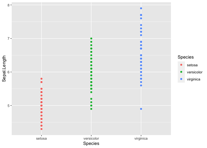
It is tough to see the distribution in this manner, but it does look
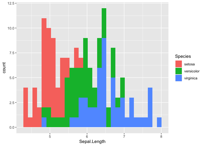
like there may be differences between the Species. Using
geom_histrogram() we can build a distribution based on the number of
observation in each bin. In this case, the x-axis will be divided into
30 equally spaced bins with values between the minimum and maximum
Sepal.Length. This method works well for continuous variables.
ggplot(iris, mapping = aes(x = Sepal.Length,  fill = Species)) +
  geom_histogram()
## `stat_bin()` using `bins = 30`. Pick better value with `binwidth`.
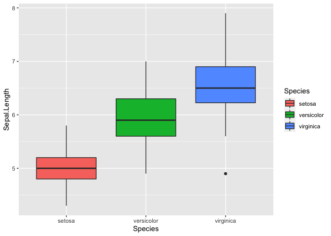
Let’s try using a box plot, also called box and whiskers, to look at the
distribution of Sepal.Length between the three species. A box plot
summarizes the data with five numbers:
- Minimum
- First Quartile
- Median
- Third Quartile
- Maximum
Typically, the rectangle spans the first and third quartile of the data set, which is also known as the interquartile range (IQR). The line in the middle denotes the median, and the whiskers above and below denote the maximum and minimum respectively. Outliers are also shown as data points that fall 1.5 times the IQR from either edge of the box.
ggplot(iris, mapping = aes(y = Sepal.Length, x = Species, fill = Species)) + geom_boxplot()
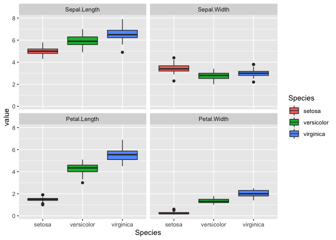
We can also plot multiple graphs using facet_wrap, but first we need
to reshape the data frame in the long format.
library(reshape2)

iris_melt <-  melt(iris, id = 'Species') #reshaping the dataframe
head(iris_melt)
##   Species     variable value
## 1  setosa Sepal.Length   5.1
## 2  setosa Sepal.Length   4.9
## 3  setosa Sepal.Length   4.7
## 4  setosa Sepal.Length   4.6
## 5  setosa Sepal.Length   5.0
## 6  setosa Sepal.Length   5.4
Now the data is in a long format where each row provides a sample id
Species, a variable, like Sepal.Length, and the corresponding value.
We can use facet_wrap to generate multiple plots.
ggplot(iris_melt, aes(x = Species, y = value, fill = Species)) +
  geom_boxplot() +
  facet_wrap(~variable)
Correlations
Interestingly, it looks like there is a correlation for some of the
variables. We can explore this by generating a correlation matrix.
First, we will exclude the fifth column since that is non-numeric. Next,
we will use the function cor().
iris_cor <- cor(iris[,-5],iris[,-5])
head(iris_cor)
##              Sepal.Length Sepal.Width Petal.Length Petal.Width
## Sepal.Length    1.0000000  -0.1175698    0.8717538   0.8179411
## Sepal.Width    -0.1175698   1.0000000   -0.4284401  -0.3661259
## Petal.Length    0.8717538  -0.4284401    1.0000000   0.9628654
## Petal.Width     0.8179411  -0.3661259    0.9628654   1.0000000
It seems that all the variables except for Sepal.Width correlate.
Let’s visualize this with ggplot(). We will need to reshape our data
first. We will also add a new color scale since the default color scale
isn’t too useful.
iris_cor_melt <- melt(iris_cor) #reshaping the data

ggplot(iris_cor_melt, aes(x = Var1, y = Var2, fill = value)) +
  geom_tile(color = 'white') + #geom_tile generates tiles which are colored based on a value
 scale_fill_gradient2(low = "blue", high = "red", mid = "white",
   midpoint = 0, limit = c(-1,1), space = "Lab")
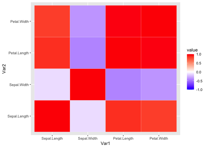
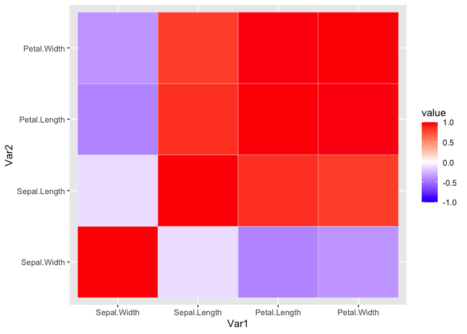
It doesn’t look too pretty. We can generate a helper function to reorder the matrix by correlation distance. This way we can easily see the variables that highly correlate.
reorder_cormat <- function(cormat){
# Use correlation between variables as distance
dd <- as.dist((1-cormat)/2)
hc <- hclust(dd)
cormat <-cormat[hc$order, hc$order]
}
iris_cor_ordered <- reorder_cormat(iris_cor)
head(iris_cor_ordered)
##              Sepal.Width Sepal.Length Petal.Length Petal.Width
## Sepal.Width    1.0000000   -0.1175698   -0.4284401  -0.3661259
## Sepal.Length  -0.1175698    1.0000000    0.8717538   0.8179411
## Petal.Length  -0.4284401    0.8717538    1.0000000   0.9628654
## Petal.Width   -0.3661259    0.8179411    0.9628654   1.0000000
Now we reshape the data and use ggplot to visualize the ordered
correlation matrix.
iris_cor_ordered_melt <- melt(iris_cor_ordered, na.rm = TRUE)

ggplot(iris_cor_ordered_melt, aes(x = Var1, y = Var2, fill = value)) +
  geom_tile(color = 'white') +
  scale_fill_gradient2(low = "blue", high = "red", mid = "white",
   midpoint = 0, limit = c(-1,1), space = "Lab")
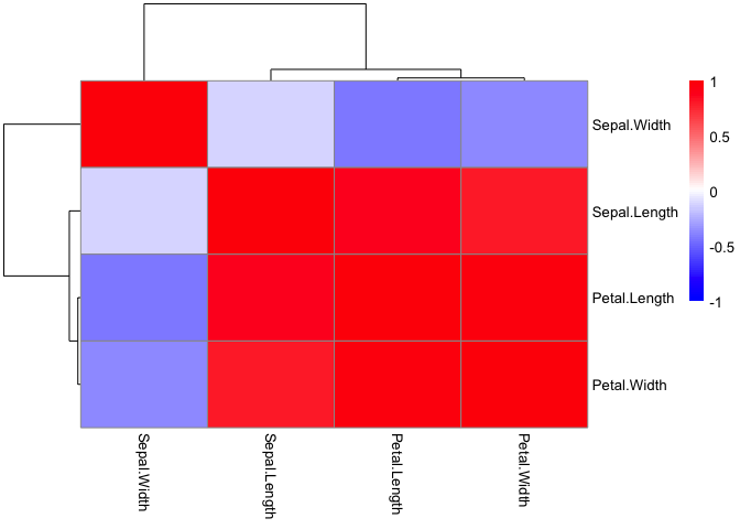
This can also be done using pheatmap with the added benefit of
pre-built ordering and cluster trees.
library(pheatmap)

pheatmap(iris_cor,
         color = colorRampPalette(c('blue', 'white', 'red'))(100),
         breaks = seq(-1,1, length.out = 100))
Statistical Testing
Based on the data, it looks like virginica has the longest
Sepal.Length. We can test for this using basic statistics. Let’s
perform a simple Student’s t-Test between virginica and setosa. We
will use the reshaped data frame and remove the versicolor species.
iris_subset_melt <- subset(iris_melt, subset = Species == 'virginica' | Species == 'setosa' ) #removing versicolor so we have the two groups we are comparing
head(iris_subset_melt)
##   Species     variable value
## 1  setosa Sepal.Length   5.1
## 2  setosa Sepal.Length   4.9
## 3  setosa Sepal.Length   4.7
## 4  setosa Sepal.Length   4.6
## 5  setosa Sepal.Length   5.0
## 6  setosa Sepal.Length   5.4
Let’s do some more data wrangling to set up our data. Essentially, we
will create two numeric vectors corresponding to Sepal.Length for both
species.
setosa_sepal_length = subset(iris_subset_melt,
                             subset =
                               variable == 'Sepal.Length' &
                               Species == 'setosa')$value  #selecting only values for setosa

virginica_sepal_length = subset(iris_subset_melt,
                                subset =
                                  variable == 'Sepal.Length' &
                                  Species == 'virginica')$value #selecting only values for virginica
With that, we are ready to perform the Student’s t-Test for two samples. Essentially, we are comparing the means of two groups with a single variable.
t.test(setosa_sepal_length, virginica_sepal_length)
##
##  Welch Two Sample t-test
##
## data:  setosa_sepal_length and virginica_sepal_length
## t = -15.386, df = 76.516, p-value < 2.2e-16
## alternative hypothesis: true difference in means is not equal to 0
## 95 percent confidence interval:
##  -1.78676 -1.37724
## sample estimates:
## mean of x mean of y
##     5.006     6.588
The graph already suggested that the two species were different based on
the Petal.Length. Here the p-value is less than 2.2e-16, where a
typical alpha is 0.05. Therefore, the null hypothesis where there is no
difference is rejected.
If we want to continue performing more comparisons, we will run into the multiple testing problem. In other words, if we keep testing different variables, we will eventually find a difference. Since, we are expecting a 5% chance of incorrectly rejecting the null hypothesis, then performing 100 multiple comparisons will result in 5 incorrect rejections or false positives. A simple way to correct for this is Bonferroni correction, which just divides the alpha by the number of total comparisons. There are additional methods, which you can read more here.
To compare multiple groups, we will perform a One-Way ANOVA. While t-tests compare only two groups, an ANOVA can compare three or more groups. One more note is that an ANOVA only tests if one or more mean is different. Post-hoc comparison test with multiple comparison correction will be needed to find which pairwise comparison was statically different.
iris_anova <- aov(Sepal.Width ~ Species, data = iris)
summary(iris_anova)
##              Df Sum Sq Mean Sq F value Pr(>F)
## Species       2  11.35   5.672   49.16 <2e-16 ***
## Residuals   147  16.96   0.115
## ---
## Signif. codes:  0 '***' 0.001 '**' 0.01 '*' 0.05 '.' 0.1 ' ' 1
There is a difference between Species just on Sepal.Length alone. It
is significant with a p-value <2e-16. However, we do not know which
direction or between which Species. We can use a pairwise t-test to
find out. First, we will try without any multiple testing correction.
pairwise.t.test(x = iris$Sepal.Length, g = iris$Species, p.adj = 'none')
##
##  Pairwise comparisons using t tests with pooled SD
##
## data:  iris$Sepal.Length and iris$Species
##
##            setosa  versicolor
## versicolor 8.8e-16 -
## virginica  < 2e-16 2.8e-09
##
## P value adjustment method: none
Now with we can try with Bonferroni correction.
pairwise.t.test(x = iris$Sepal.Length, g = iris$Species, p.adj = 'bonf')
##
##  Pairwise comparisons using t tests with pooled SD
##
## data:  iris$Sepal.Length and iris$Species
##
##            setosa  versicolor
## versicolor 2.6e-15 -
## virginica  < 2e-16 8.3e-09
##
## P value adjustment method: bonferroni
The result is still the same, but it may not always be the case. See here.
If we wanted to plot the resulting p-values, then we can use the package
ggpubr.
library(ggpubr)

ggplot(iris, mapping = aes(y = Sepal.Length, x = Species, fill = Species)) +
  geom_boxplot() +
  stat_compare_means()
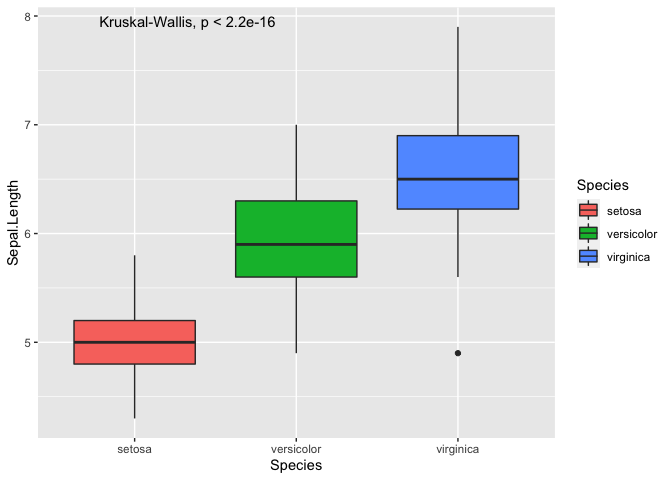
As you can see, we can plot the p-value from an ANOVA directly onto the
plot, which only tells you that there is a difference but not between
which pair of Species. To perform the pairwise comparisons, you have
to manually generate a list of pairwise comparisons.
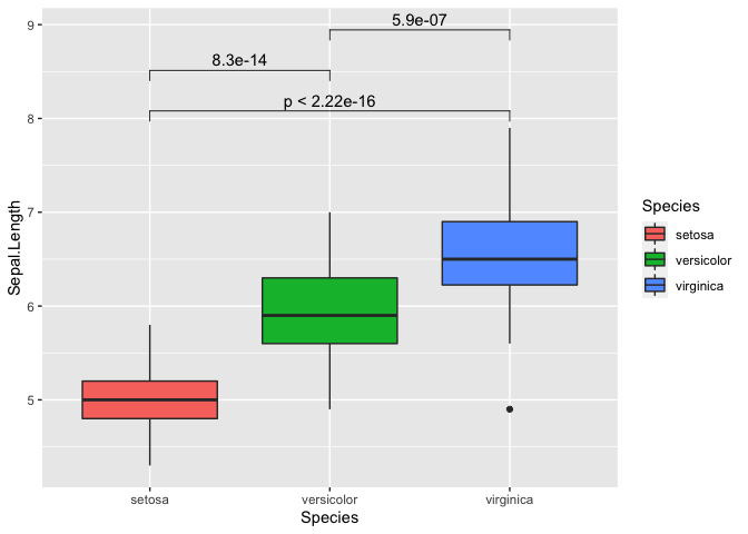
my_comparisons = list(c('setosa','virginica'), c('setosa','versicolor'), c('versicolor','virginica'))

ggplot(iris, mapping = aes(y = Sepal.Length, x = Species, fill = Species)) +
  geom_boxplot() +
  stat_compare_means(comparisons = my_comparisons)
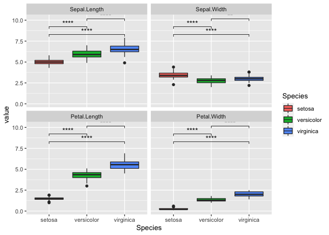
We can also repeat this with all variables as well. It can get a bit
messy so we will switch the p-value to “p.signif”. This essentially uses
the * symbol for the following:
- ns: p > 0.05
- *: p <= 0.05
- **: p <= 0.01
- ***: p <= 0.001
- ****: p <= 0.0001
ggplot(iris_melt, aes(x = Species, y = value, fill = Species)) +
  geom_boxplot() +
  facet_wrap(~variable) +
    stat_compare_means(comparisons = my_comparisons, label = 'p.signif')